

Building a travel spend dashboard with AI
This experimental project was entirely designed with the support of AI, from research to ideation.
I chose to focus on a persona that is often overlooked in travel design projects: the Travel Manager. Their role is critical in monitoring business travel spend, ensuring policy compliance, and balancing cost efficiency with traveler satisfaction.
My challenge was to design a data dashboard that would help them make smarter, faster decisions, while relying solely on AI tools at every stage of the process, from generating personas and interview insights to creating wireframes, testing, and iteration.
Introduction
When AI started gaining traction in the design world and beyond, I immediately wanted to explore its potential, experiment, and iterate endlessly.
In addition to regularly exchanging ideas with peers about integrating AI into our creative workflows, I actively monitor emerging tools and new trends.
Since AI usage is restricted in my current company for compliance reasons, I’ve dedicated personal time to deepening my practice and experimenting independently. I’m also a member of the AI Discipline community and frequently attend AI-focused meetups hosted by Figma Makers, Mistral AI, Doctolib, and others.
I decided to include this experimental AI project in my portfolio because it illustrates the vast possibilities AI opens up in design.
Design Process
Defining real user needs with AI
This first step focused on understanding our target user, the Travel Manager, entirely through AI-driven research methods. Using generative tools, I simulated user interviews, analyzed common patterns, and synthesized insights to define realistic pain points and goals. This approach allowed me to recreate a traditional research phase while relying exclusively on AI to extract, structure, and prioritize user needs.
Building our user persona
To start the research phase, I generated a Travel Manager persona based on real-world data and industry insights, as well as my personal experience.
The goal was to capture the daily challenges, motivations, and habits of someone managing large-scale business travel. Using this input, I created a detailed persona profile in FigJam, highlighting key information such as demographics, work environment, goals, frustrations, and preferred tools. This exercise provided a strong foundation for the rest of the project, ensuring that every design decision would stay aligned with the Travel Manager’s real needs and behaviors.
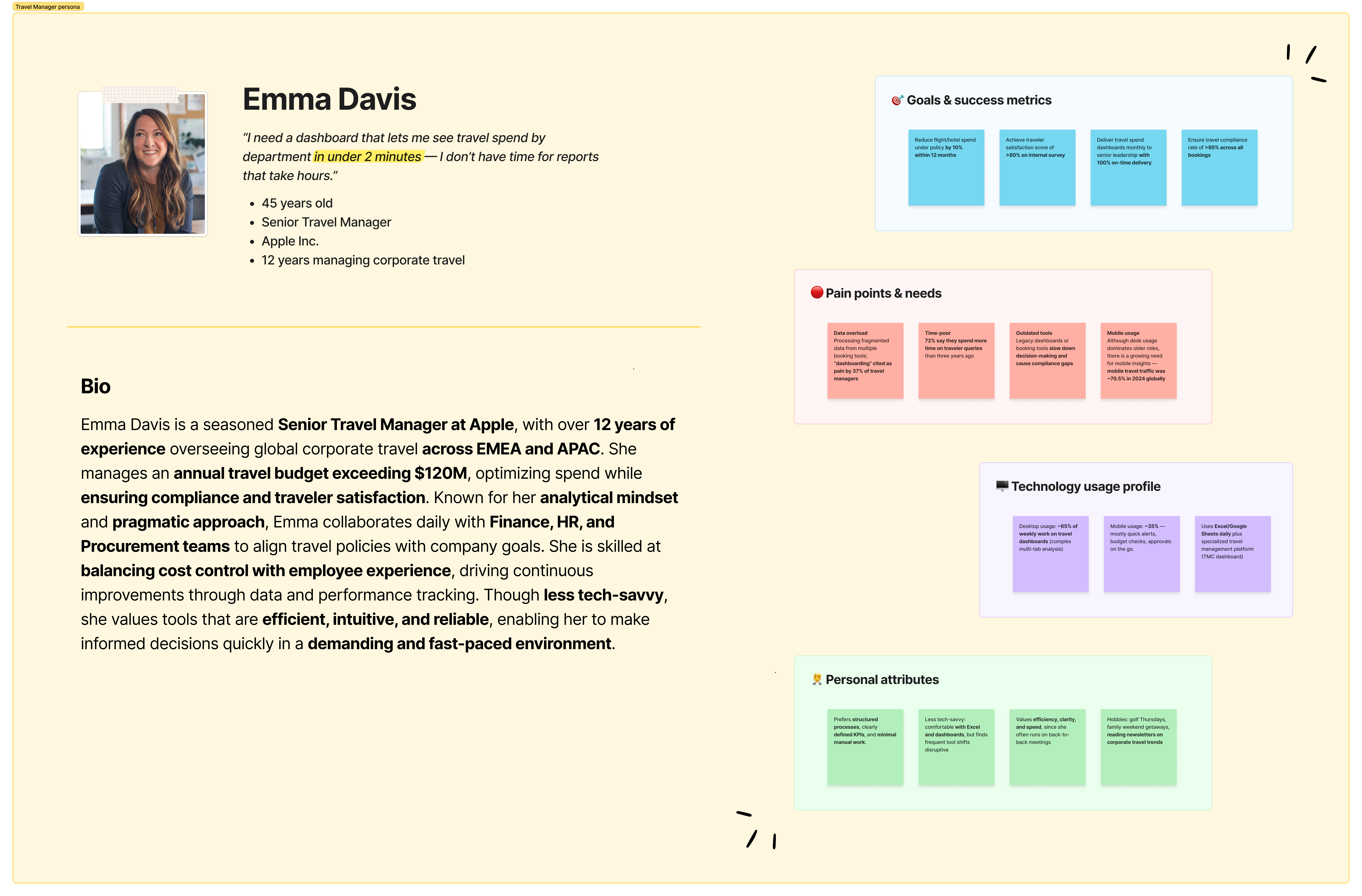
The Travel Manager user persona
Creating the user interview guide
To deepen my understanding of the Travel Manager’s expectations, I crafted a structured interview guide. This guide followed UX research best practices and was divided into key sections: user profile, company context, dashboard usage, and pain points.
The questions explored how Travel Managers currently monitor travel data, what information they value most, and which features would make their daily work easier. By generating and refining this guide with AI, I ensured a comprehensive and unbiased framework ready to simulate realistic user interviews.
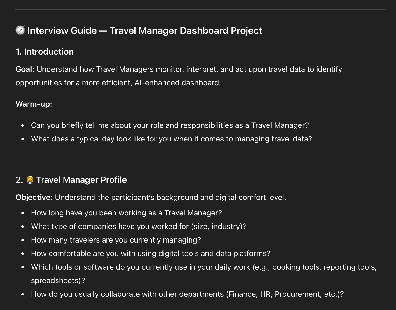
User interview guide
Extracting user insights
Using the interview guide, I simulated five realistic user interviews with Travel Managers of different ages, company sizes, and levels of tech proficiency.
Each persona provided unique perspectives on their challenges, workflows, and expectations regarding travel data management.
Once the interviews were completed, I analyzed and clustered the insights by theme, such as data accessibility, reporting frequency, and desired automation features. This synthesis allowed me to clearly identify recurring needs and prioritize the most impactful opportunities for the dashboard design.
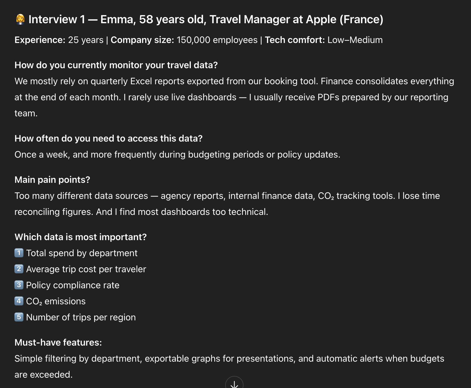
Simulated interview #1
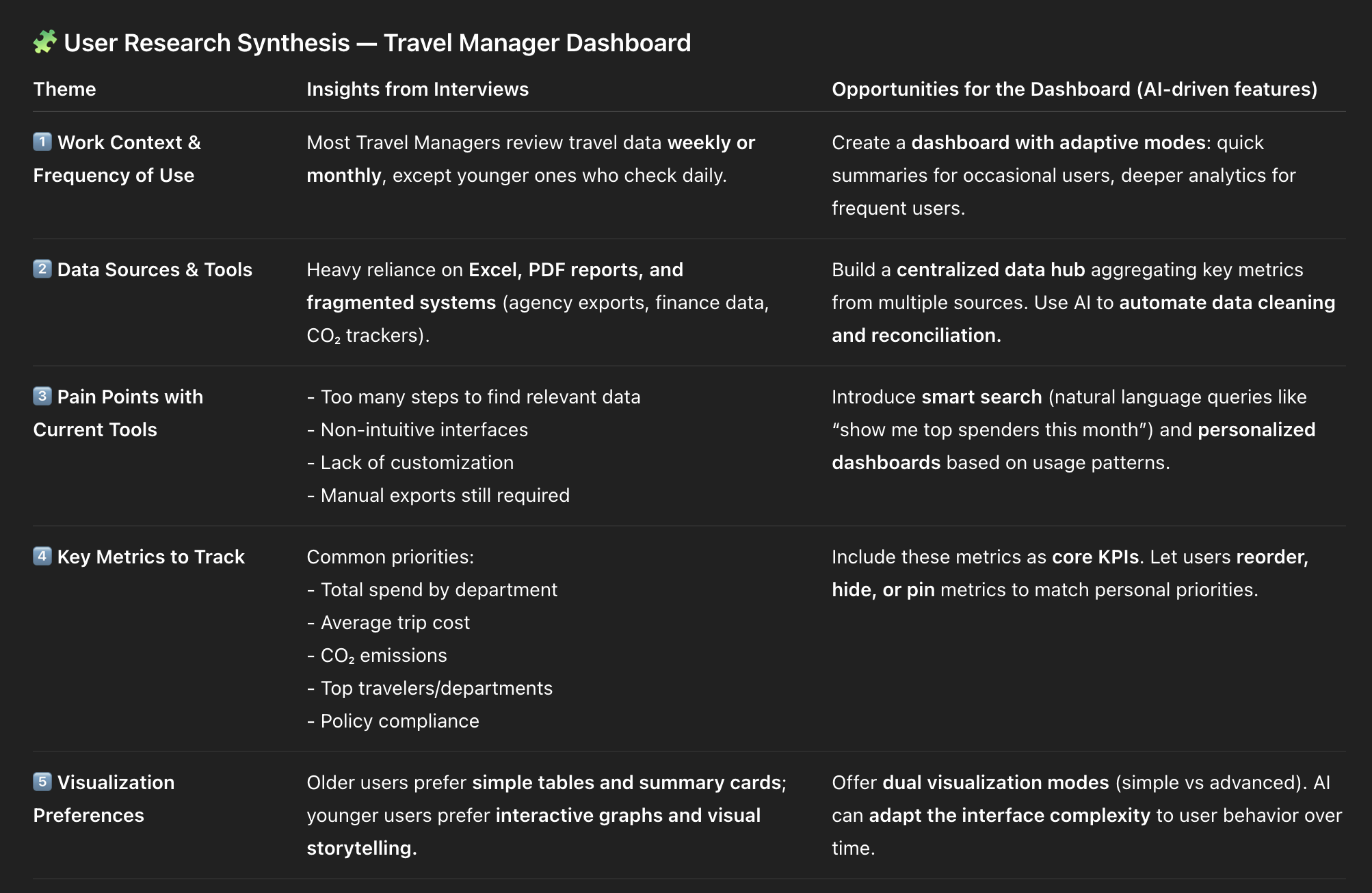
Interview synthesis
Key takeaways for design
Build an AI-powered, modular dashboard that adapts to different user profiles (tech-savvy vs traditional)
Focus on simplicity, personalization, and automation rather than feature overload
Include natural language interactions and automated reporting for time-pressed users
Combine business KPIs + sustainability metrics to align with modern corporate goals
Creating a realistic dataset
To design a dashboard that truly reflects real-world usage and edge cases, I needed a believable dataset that would make my design decisions more grounded and relevant.
To generate this realistic dataset, I asked ChatGPT to:
Define the key data categories relevant to a Travel Manager’s dashboard (employees, departments, destinations, carbon emissions...)
Generate a fake dataset containing diverse travel records across multiple departments and global destinations
Ensure data variability by including spend amounts, trip dates, anomalies, and sustainability metrics (CO₂ emissions)
Expand the dataset to 200 unique entries to ensure statistical relevance and realistic visualization potential
Export the final dataset into a CSV file format, ready to be used for dashboard design and testing
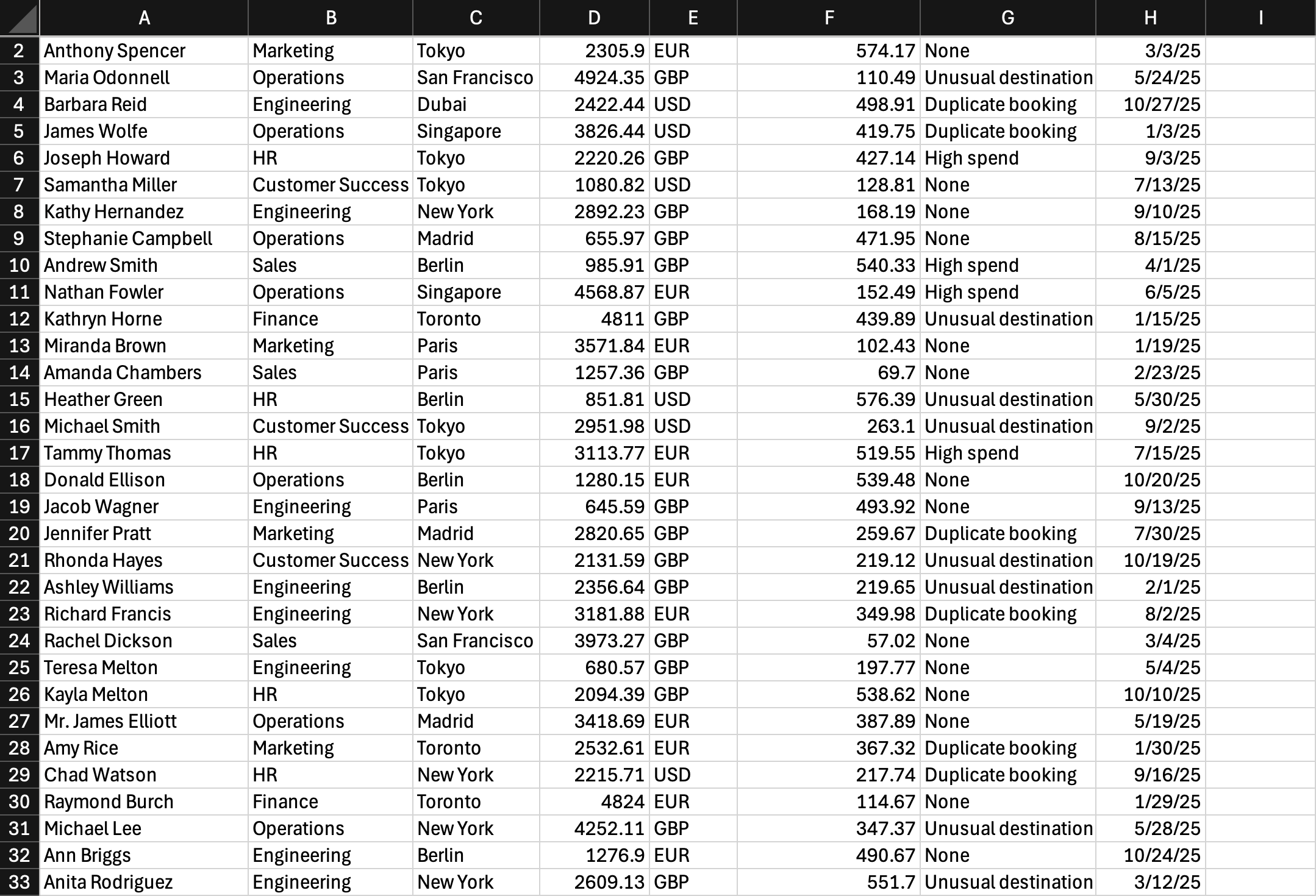
CSV file generated by ChatGPT
AI-assisted exploration
I first asked ChatGPT to generate a detailed prompt that I could then use with other LLM-based design tools. Using this prompt, I created wireframes with Lovable and V0, comparing how each tool interpreted the brief and translated user needs into design solutions. I asked each tool to explore four different layout possibilities.
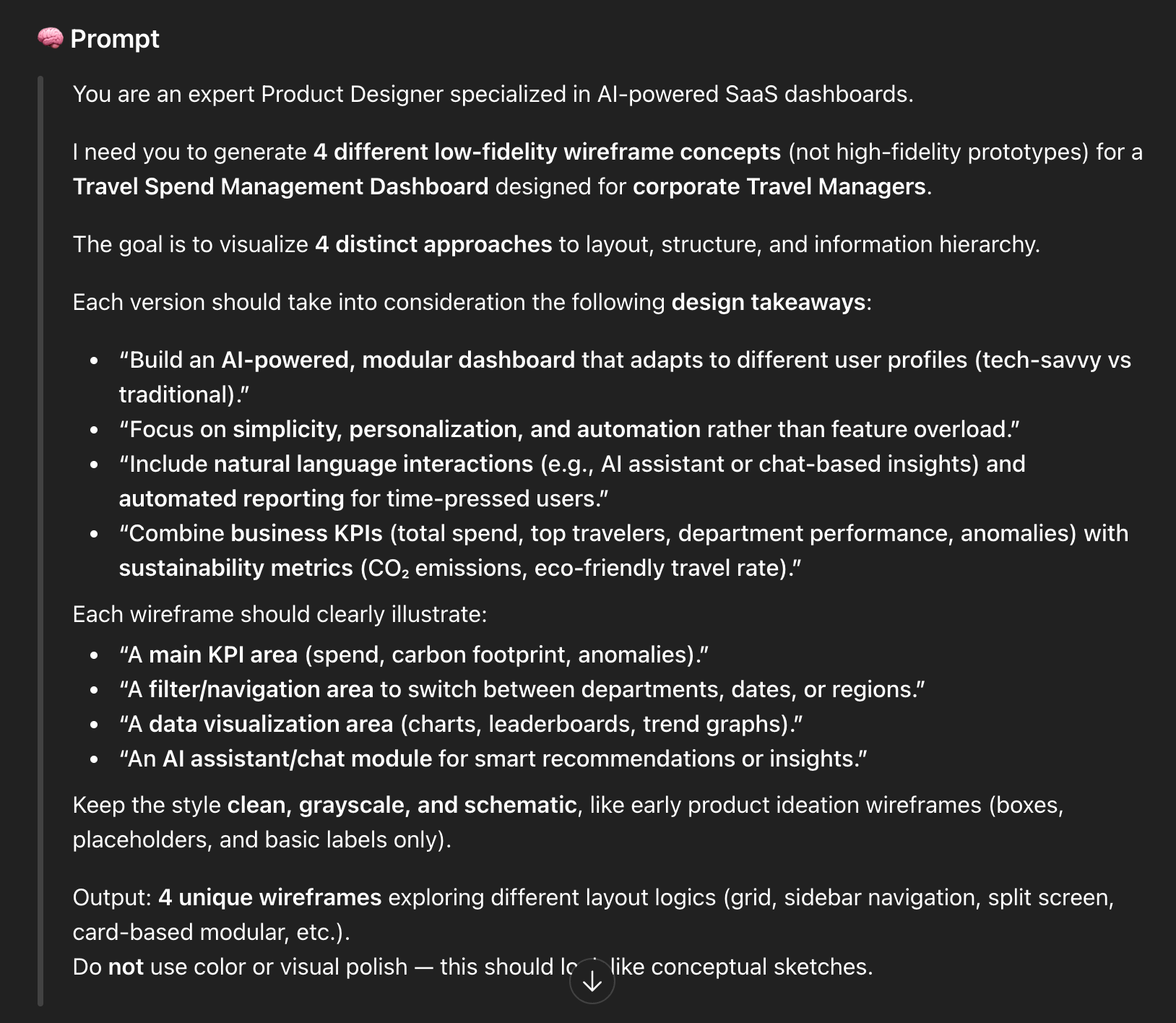
Detailed prompt generated by ChatGPT
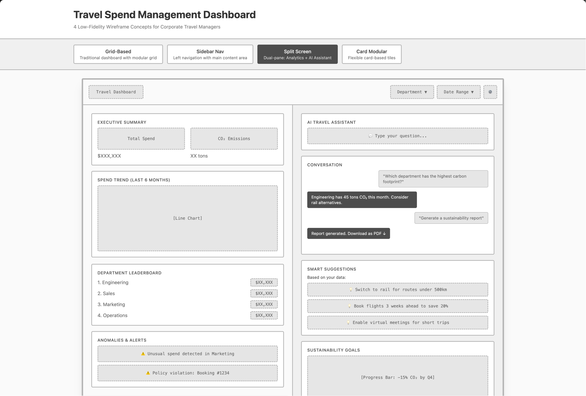
Wireframe generated by Lovable
Iterating on the wireframes
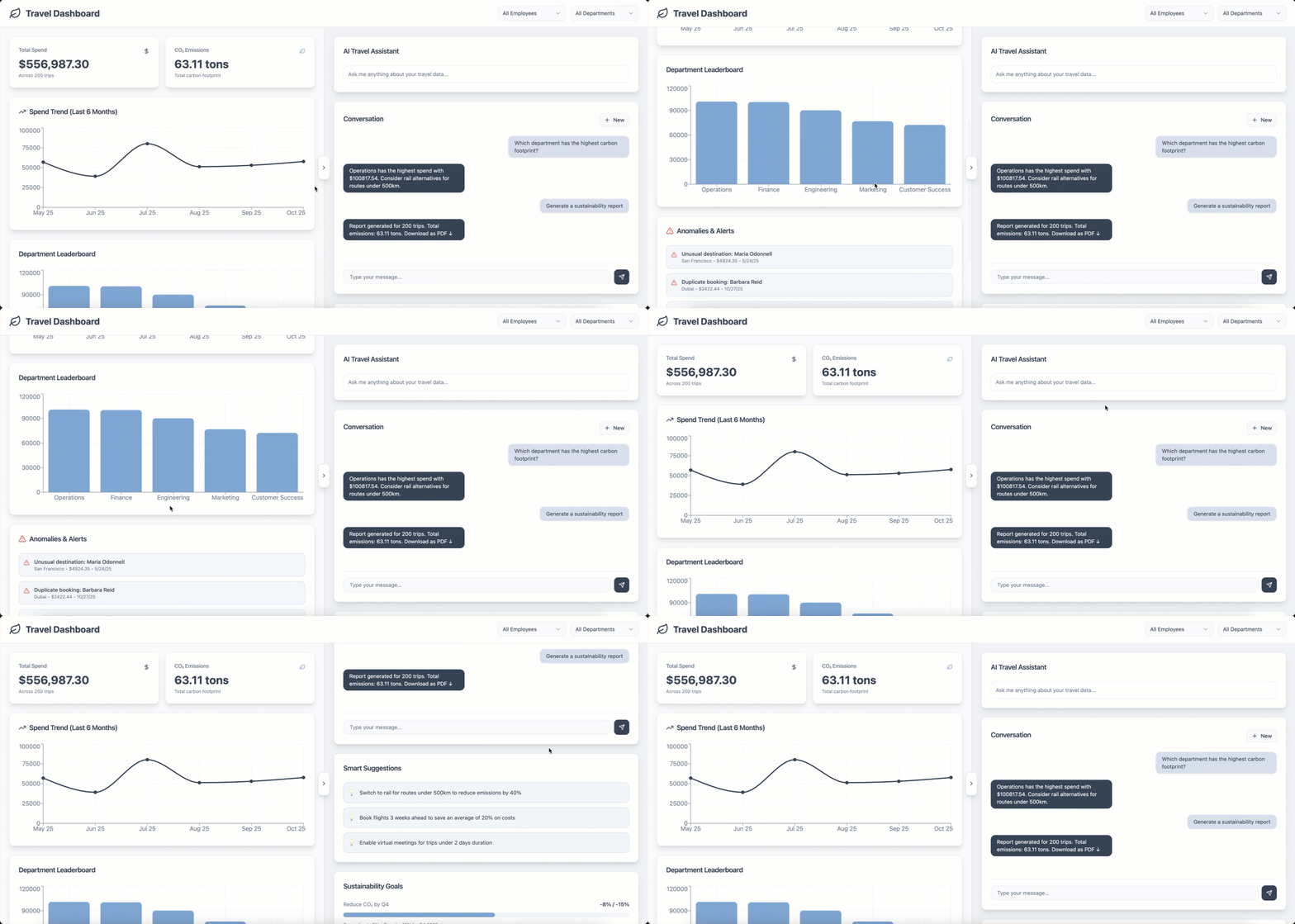
After reviewing the wireframes, my preferred concept was the split-screen layout, for several reasons:
It introduced a disruptive and modern approach compared to traditional dashboard designs
It integrated the AI Assistant directly within the interface, encouraging users to interact with it naturally
It provided more space for AI-driven features, such as smart suggestions, clearly demonstrating the assistant’s added value
Building on this concept, I asked Lovable to refine the layout by incorporating the following improvements:
Allow users to close, reduce, or reopen the AI Assistant panel (positioned on the right)
Keep the AI panel open by default, while maintaining the flexibility to close it
Ensure the left panel is responsive, expanding to full width when the assistant is closed
Add an “Employee” filter, complementing the existing Department and Date range options
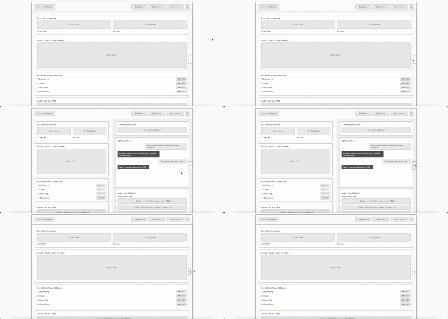
Second iteration
As a final adjustment, I asked Lovable to reposition the collapse button so it sits centrally between the two sections, rather than being placed entirely on the right side of the interface.
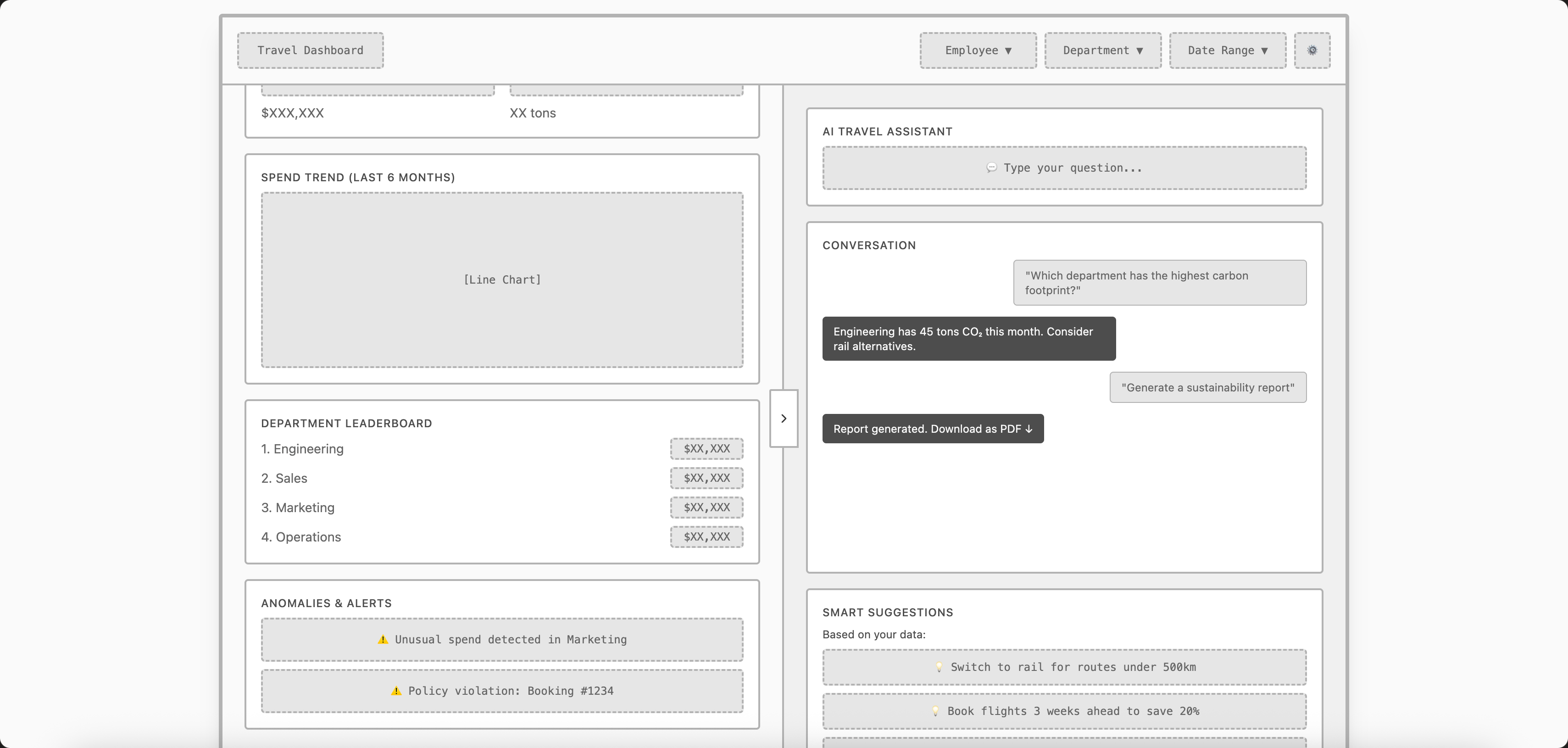
Third iteration
I chose not to focus too much on small details at this stage, as it was only a first draft. It allowed me to get a clearer vision of the dashboard’s overall structure and interactions. In my view, it effectively captured the intent of creating a dynamic, AI-assisted data visualization, which led me to progress toward the high-fidelity prototyping phase.
Build interactive prototypes and iterate with AI feedback
For the prototyping generation phase, I returned to ChatGPT to create a detailed and structured prompt specifically designed for Lovable. The goal was to move from wireframes to a high-fidelity prototype that visually captured the final look and feel of the dashboard.
In the prompt, I included the brand color palette to define the visual identity and ensure consistency, as well as the CSV file containing realistic travel data, which allowed Lovable to populate the dashboard with credible and data-driven content.
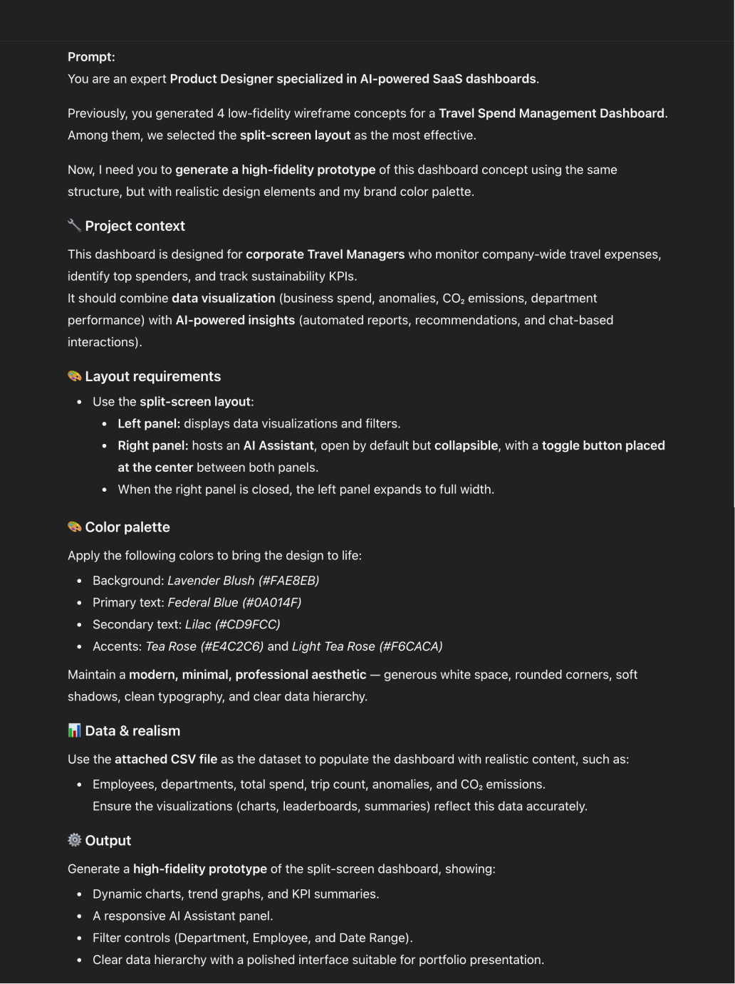
Prompt generated by ChatGPT for Lovable
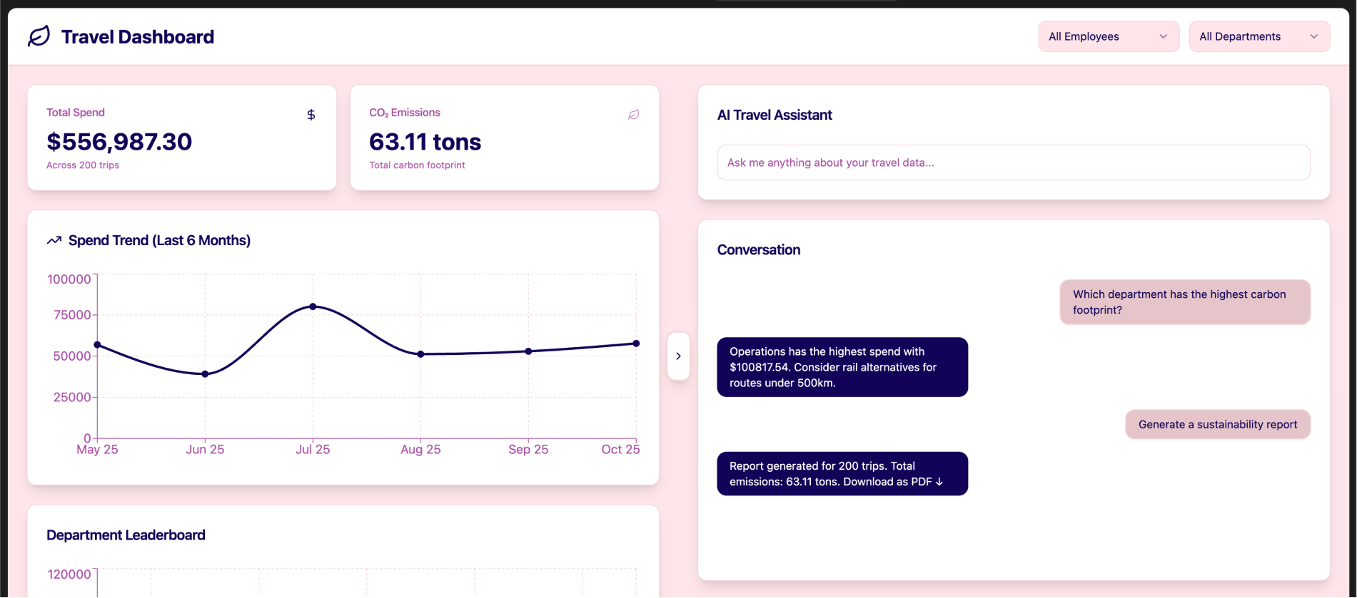
1st version of the prototype
After generating the first version of the prototype, I decided to run several iterations to refine both the visual balance and usability of the interface.
Here are the main improvements I applied:
Adjusted the background color to a light grey tone for better readability and contrast.
Fixed alignment issues within the Smart Suggestions section
Updated the color palette to achieve a more professional and cohesive look
Increased the contrast between the left and right panels, making the split-screen structure more visually distinct
In the conversation section:
Added a “New Conversation” button at the top right corner of the card for quick access.
Included a message input field below the chat messages, allowing users to easily continue their conversations with the AI assistant
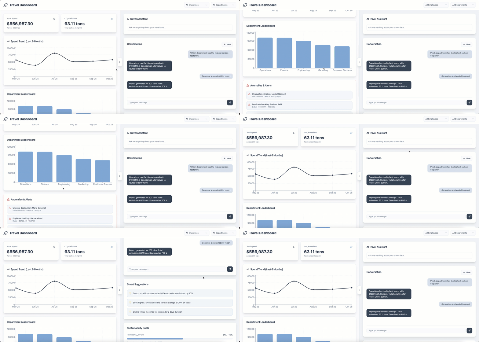
The prototype after several iterations
Iterating with AI feedback
To refine my prototype, I shared a screenshot of the dashboard with ChatGPT and asked for a detailed UX and accessibility review. Based on the feedback, I then requested a structured prompt specifically tailored for Lovable to apply the recommended improvements. After generating the updated version in Lovable, I made a few final adjustments myself to polish the visual design.
Review this screenshot. Identify 10 UX issues, accessibility problems, and give 5 improvement suggestions prioritized by impact.
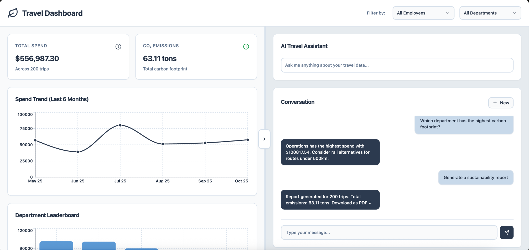
Final version
Simulated testing
To test my prototype's usability, I provided ChatGPT with the following hypotheses:
The double scroll/navigation might be confusing
The number of graphs on the page might not be enough
We might need more filters
The "anomalies and alerts" section might be too highlighted
We might need sub-sections in the dashboard, with a navigation bar
I then asked it to generate a detailed usability testing plan to validate or invalidate each of them. I asked for the following items to be included in the test plan: the test objectives, the typology of participants, the method, the tasks, and the success metrics.
ChatGPT generated the test plan, and I ran the test simulation.
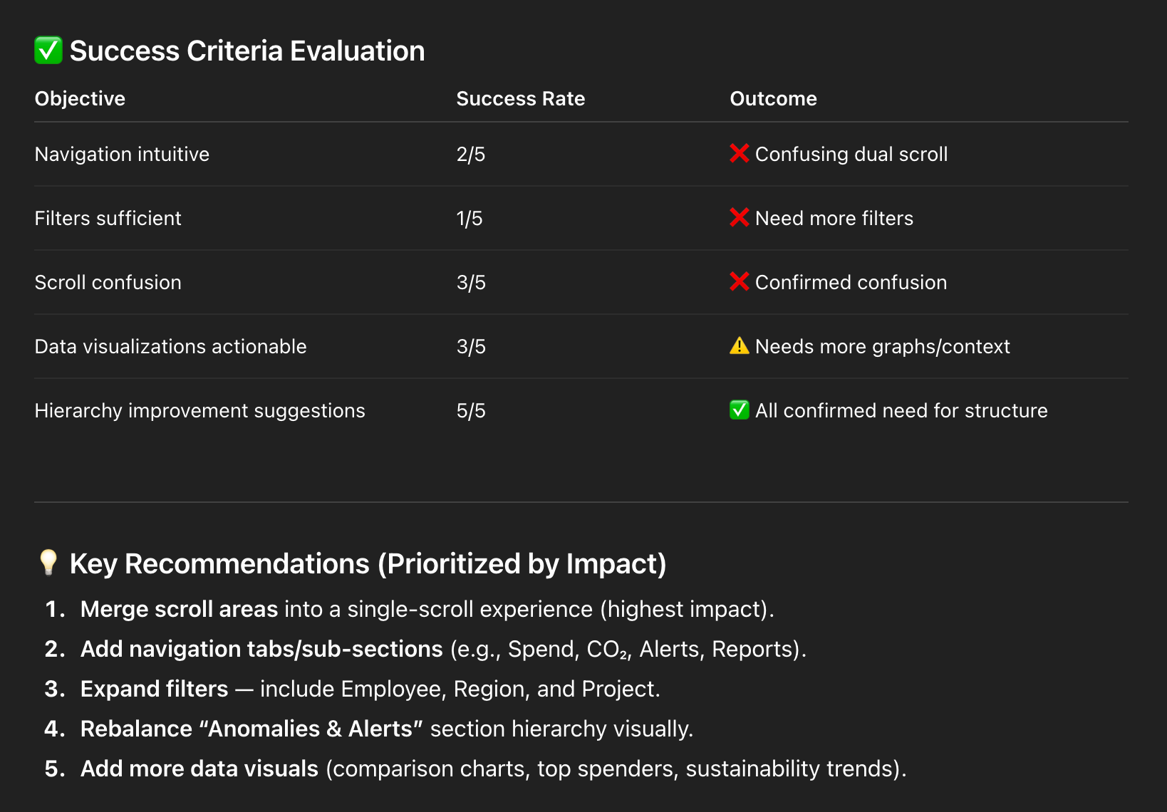
A sample of the tests results
I then shared the key recommendations from the usability report with Lovable and asked the tool to apply the improvements directly to the prototype.
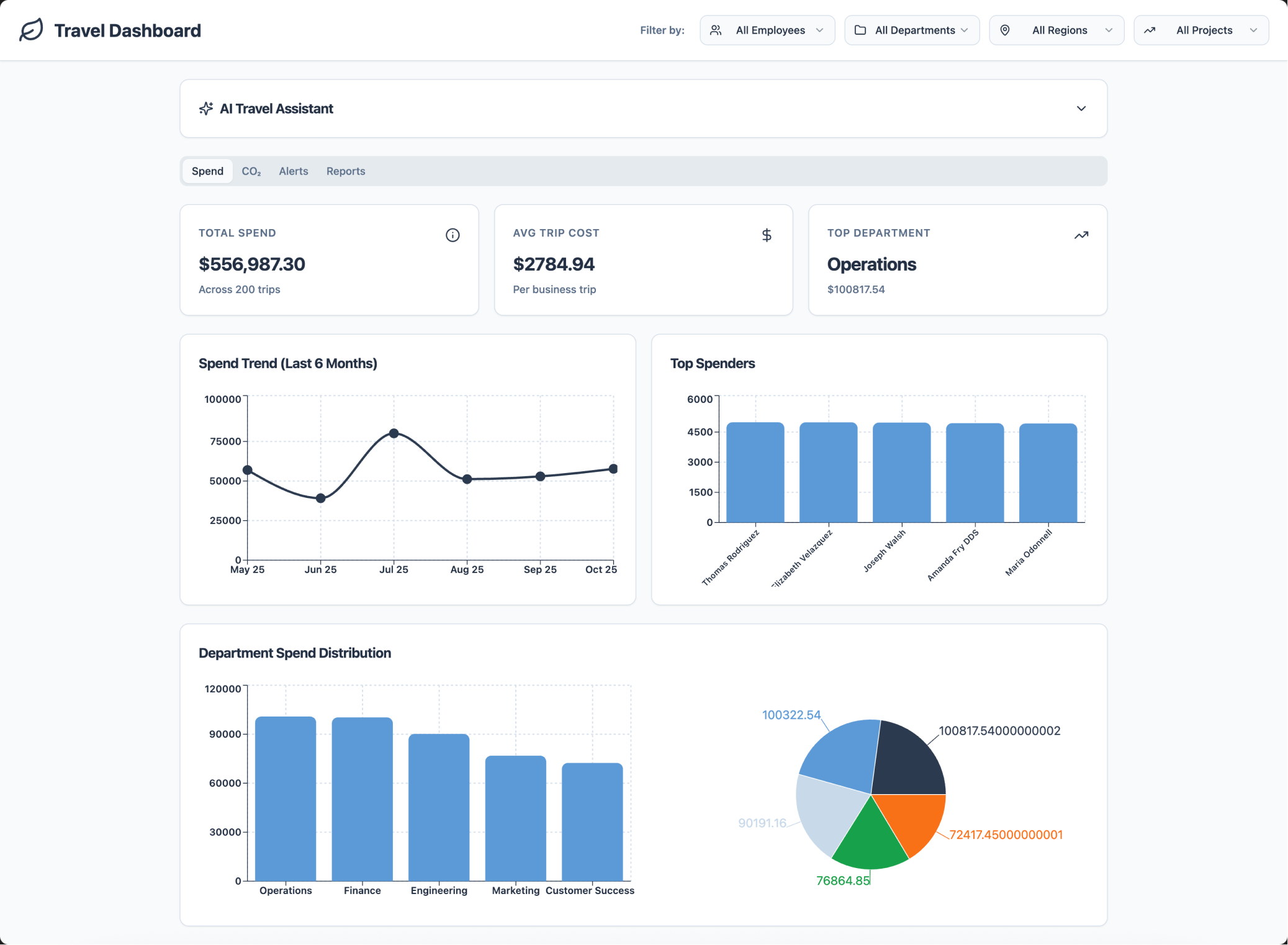
Last iteration, after incorporating usability feedback
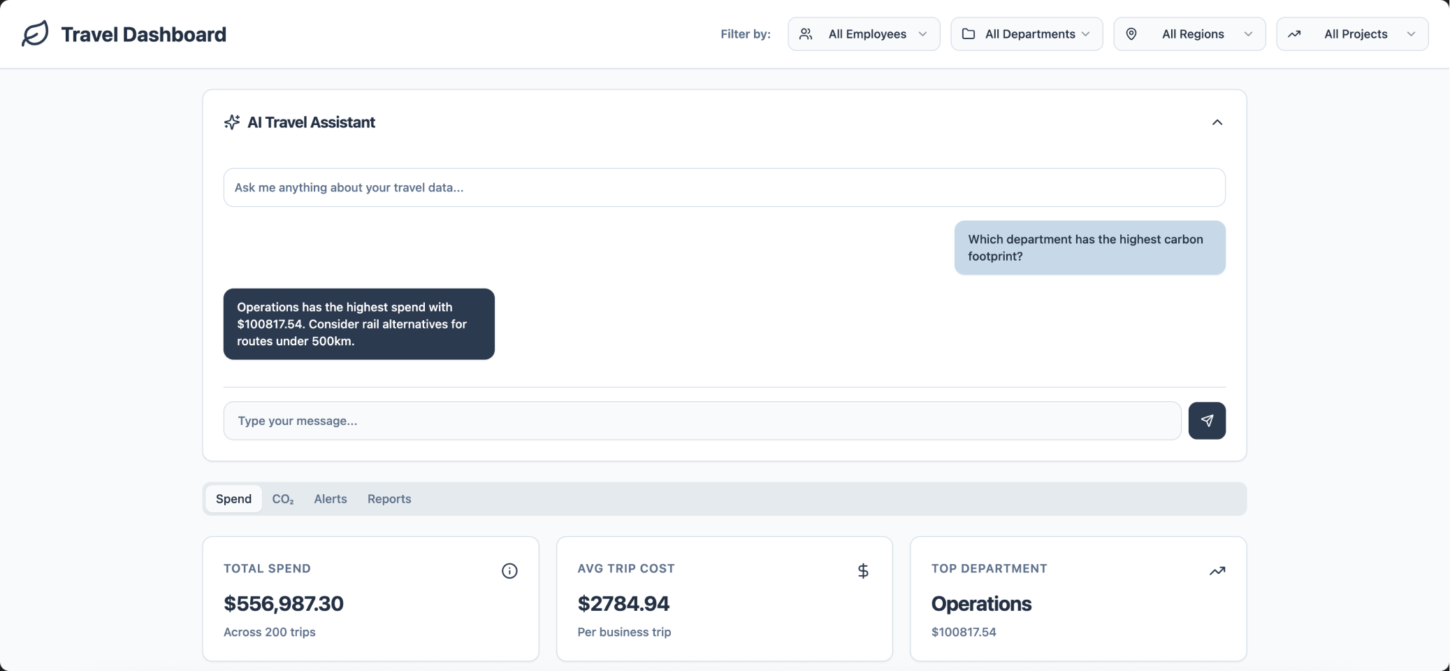
Expanded view
Key learnings
Here's a summary of what I learned during this experimental project:
Working with fake data has its limits. It doesn’t always reflect the real behaviors, constraints, or nuances of actual users. In a real project, I would definitely rely on real user input
When exporting an AI-generated document (for example, the interview guide), ChatGPT puts some random icons, and it’s better to do the formatting yourself if you want it to be actually used, by you and by other people
Translating ideas into visuals through AI can be challenging. When you have a clear concept in mind, sketching on paper often remains faster and more precise
While generating fake data, I had to iterate several times to remove duplicates and ensure realistic diversity
AI is great for early-stage exploration and conceptual thinking, but less effective when you already have a defined vision. In those cases, Figma remains the best tool
AI helps to conceptualize ideas quickly, but it can oversimplify B2B complexity, missing real-world variables like data structure, user roles, and configurations
For usability testing, I find it more insightful to test an entire user flow rather than a single page, as it provides a better view of user behavior and context