
Metro Ticket in Paris
Introduction
Paris is beautiful, but when it comes to riding the metro, the city of Love does not seem so charming anymore.
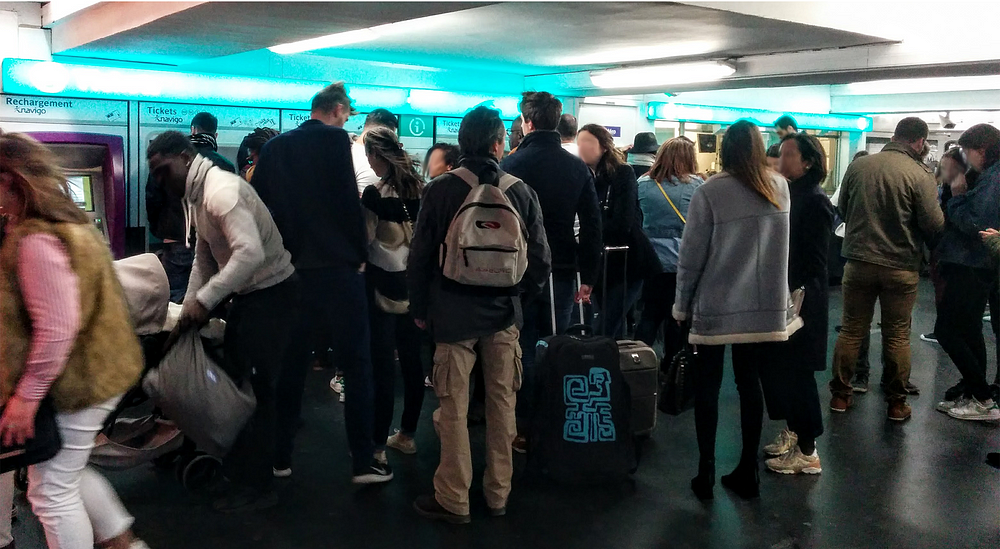
No more of this?
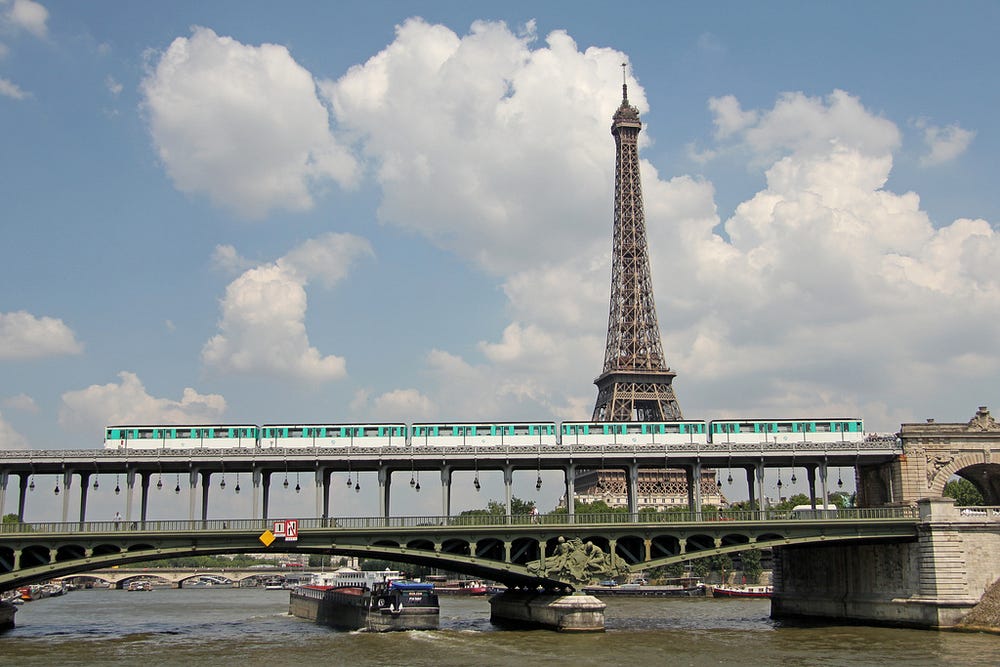
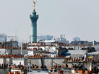
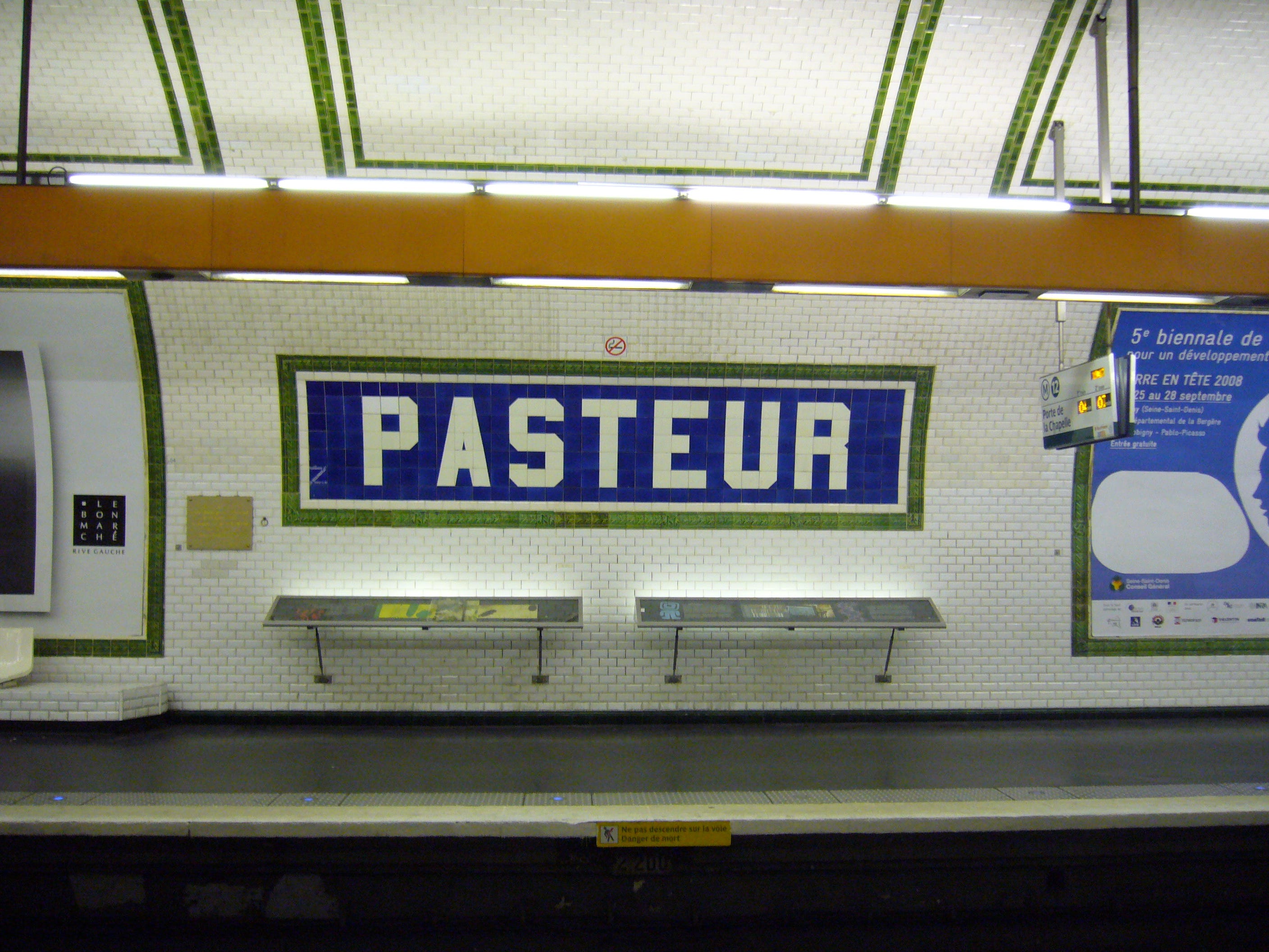
Line 6 on Bir-Hakeim bridge
The context of use


The Situation
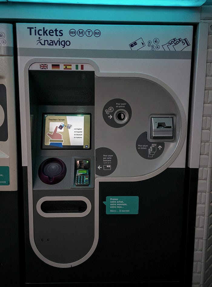
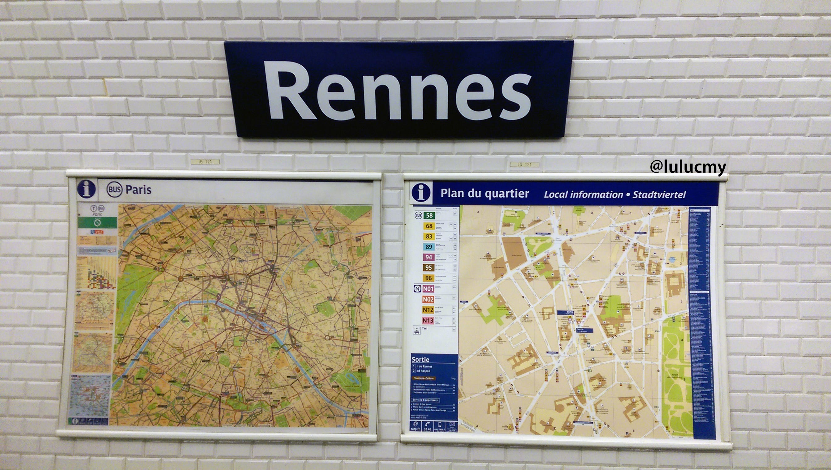
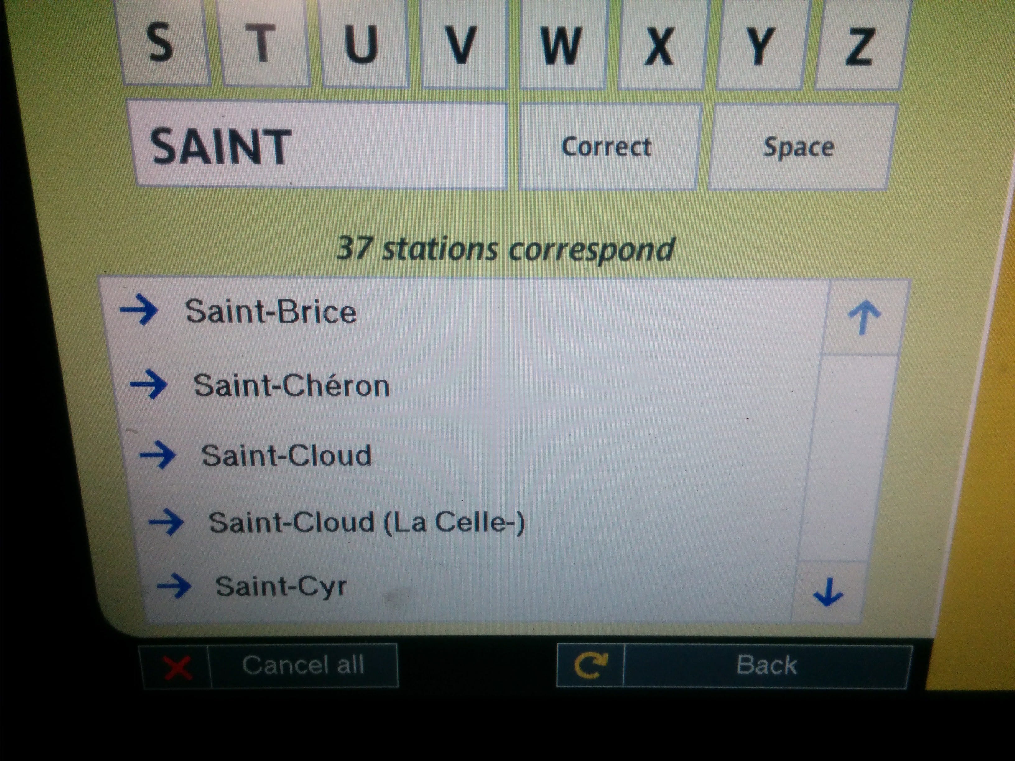
The experience of using the machine, or waiting for people to finish their order so that you can do yours, is not satisfying — not to say frustrating. I had this pain point and couldn’t believe I was the only one. By asking people around me, it quickly confirmed there was an issue with this experience. Especially from my foreign friends which qualify it, and I am quoting them here, as a “pain in the a**.”
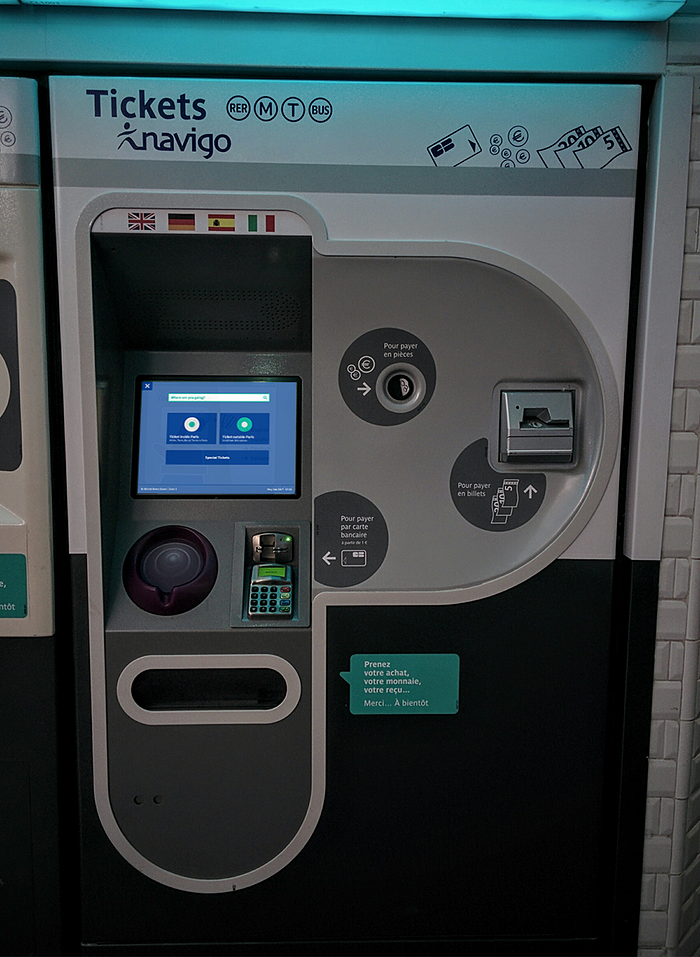
The Parisian’s ticket machine
Current IA of the system
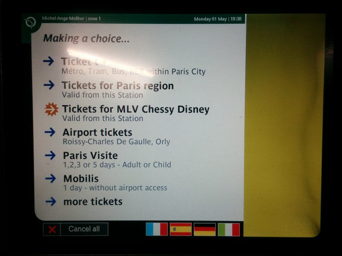
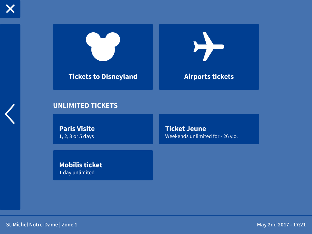
The main menu
Objectives
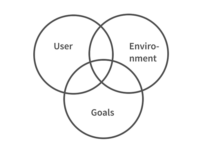
For a widely used machine like a ticket machine, addressing various personas needs can be necessary. The final objective would be to reduce the time to purchase in order to reduce waiting queues while giving satisfaction to the user. Therefore, mixing business and UX goals.
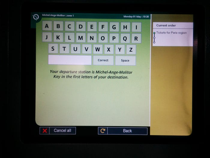
Test results
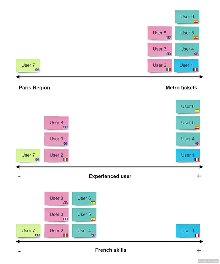
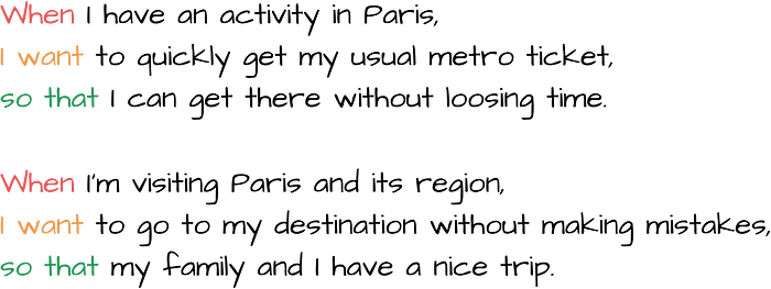
Metro traveler’s jobs stories
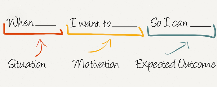
Jobs Story Framework
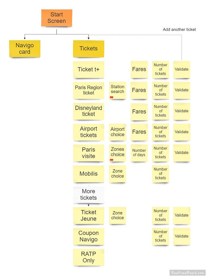
Design Process
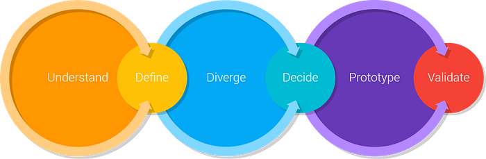
I decided to run a 5-day sprint, from Monday to Friday. I would work on this as a side-project after work. I followed GV’s process for this sprint.
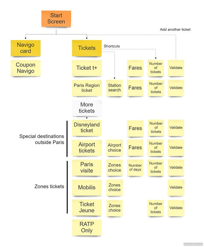
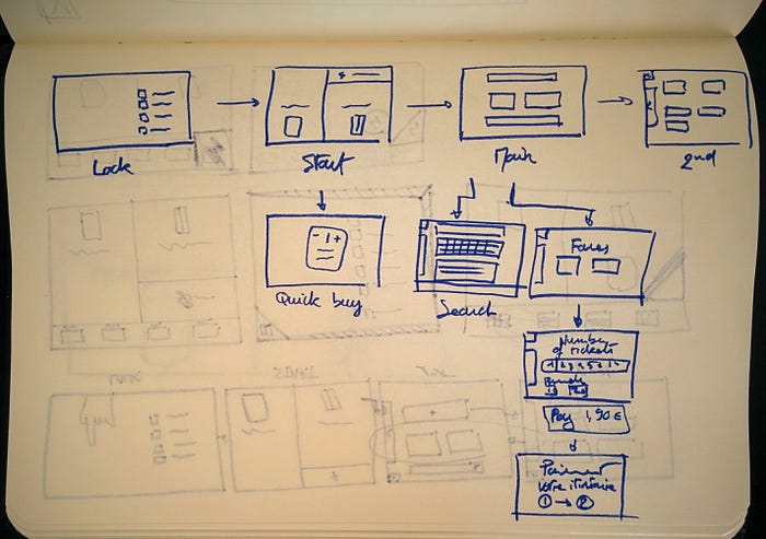
New Information Architecture
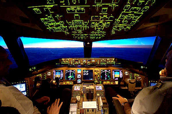
Efficiency by control vs. efficiency by progressive disclosure

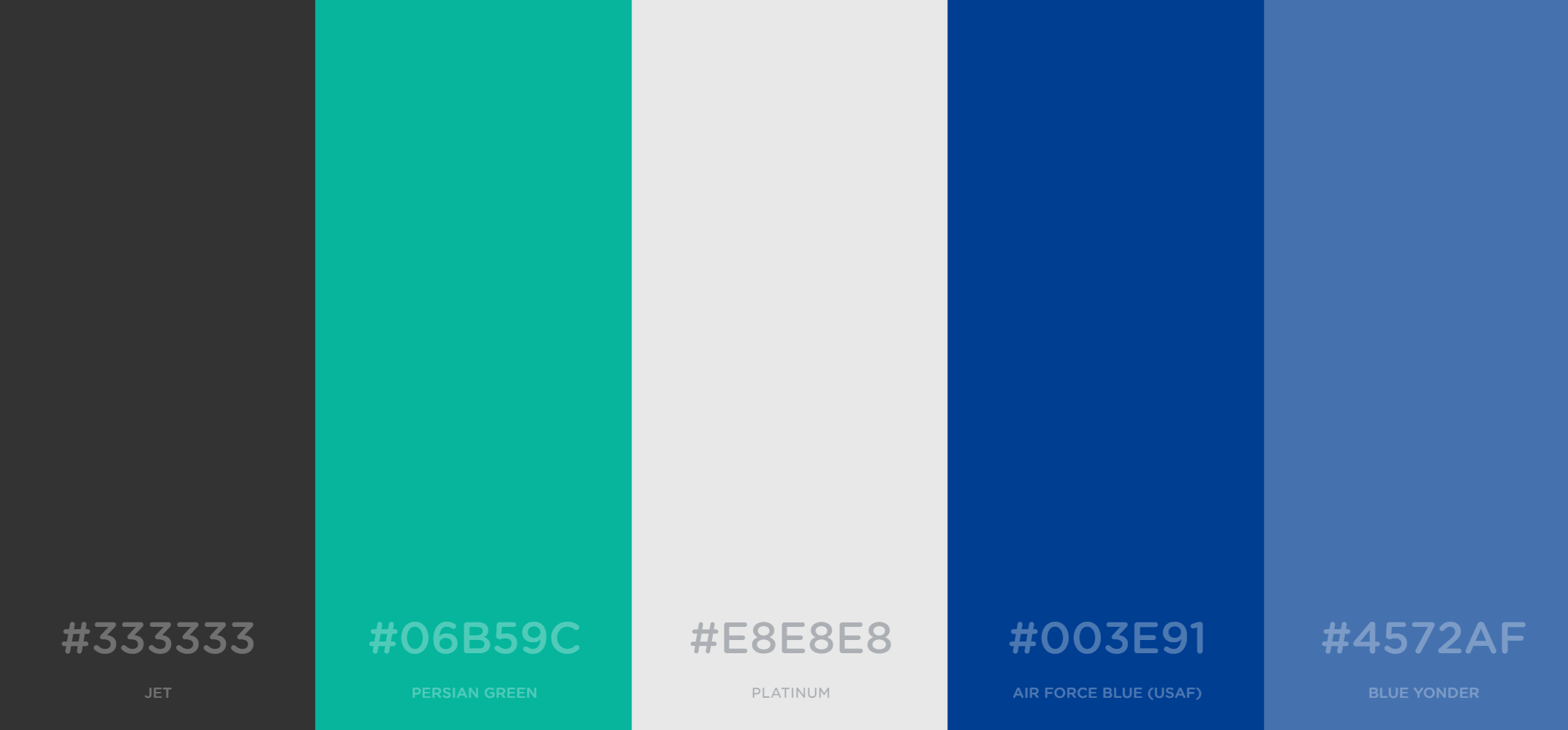
Color palette inspired from the RATP logo
Key Decisions
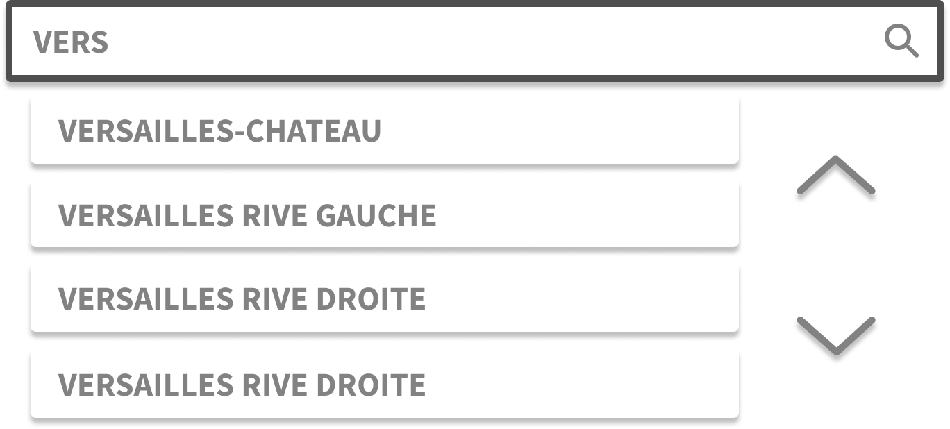
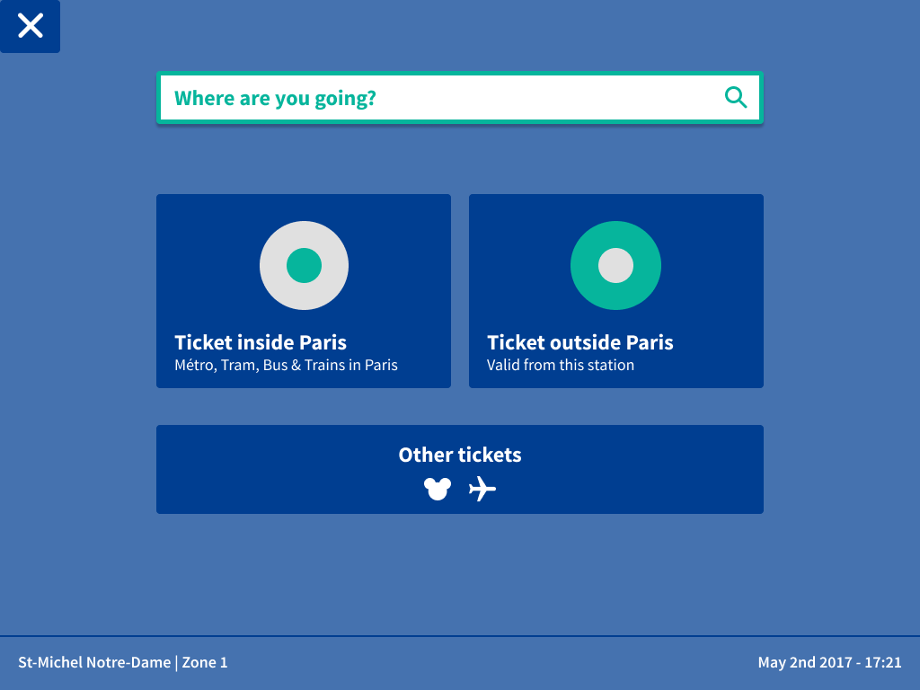
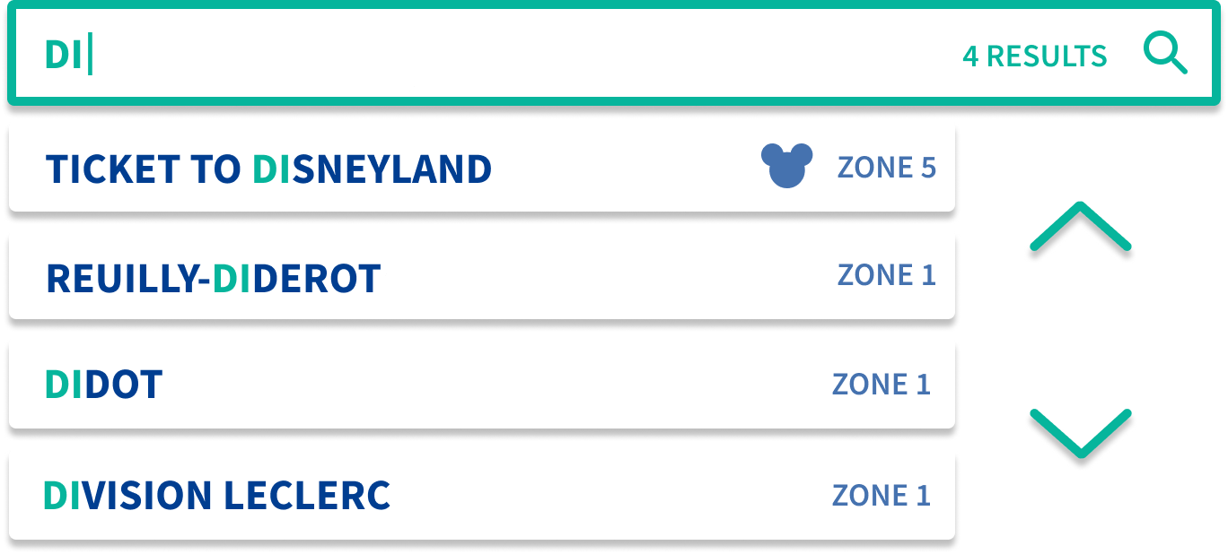
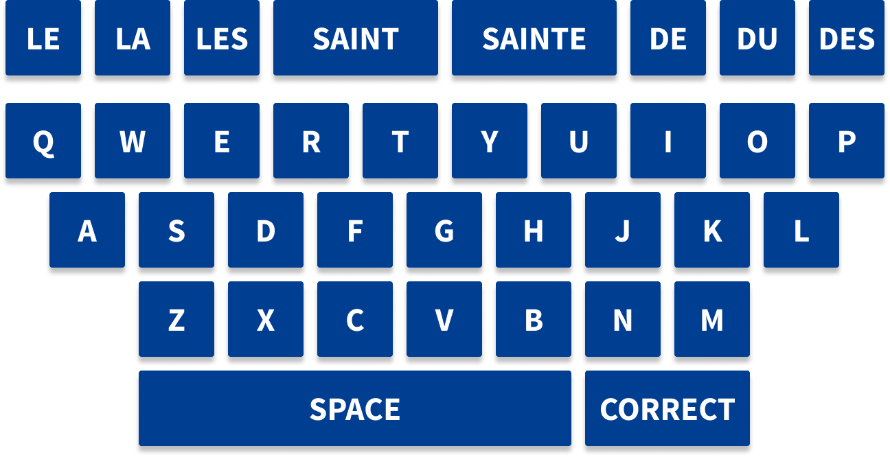
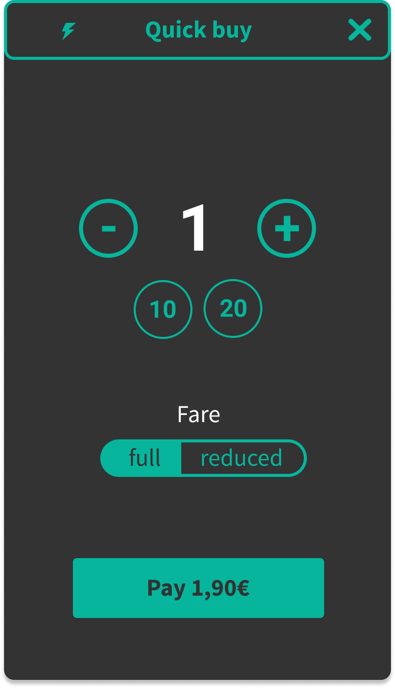
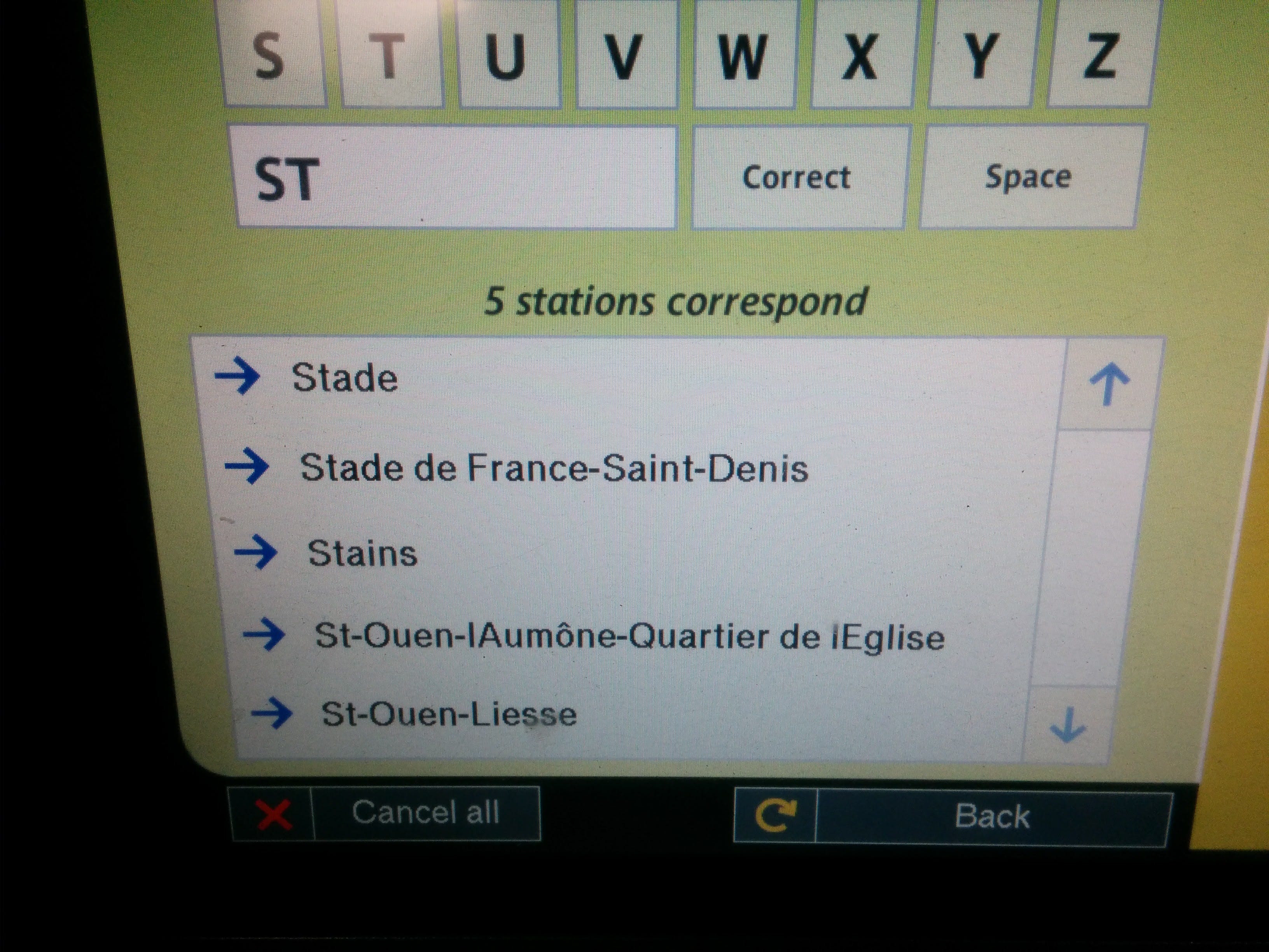
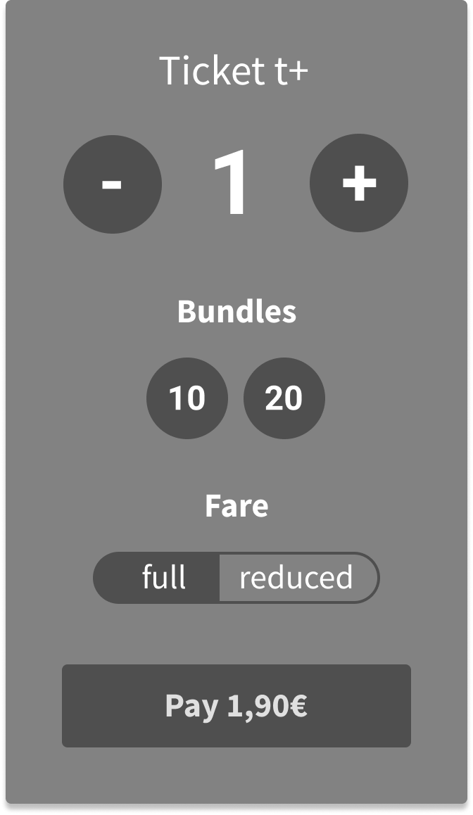
The idea I chose was based on providing shortcuts to get your metro ticket (efficiency by control), guiding inexperienced users with progressive disclosure and adding a search bar right from the menu screen.

Interface details

Interface details after a first round of iterations
Prototype overview
Outcome and Impact
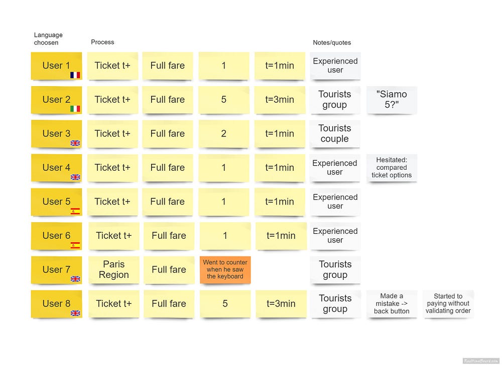
Testing with the prototype brings a lot more fidelity to the test and gives the user a much better sense of what the actual feeling will be like. The objective was to validate whether the 3 pain points were solved.

Final interface design

Final interface details
Final prototype interaction
Learnings and Reflections
From these tests, I learned that providing a good impression is crucial, as it will impact the entire Paris experience. We have indeed several cognitive biases that lead us to confirm our first impression.
User testing in progress
User feedback session
Reflections on user experience
Conclusion
The redesigned metro ticket purchasing experience aims to enhance user satisfaction and efficiency, ultimately contributing to a more positive overall experience of Paris.

Final thoughts on the project

Final interface overview

User journey mapping
Role and Contribution
As the designer, I was responsible for conducting user research, defining the problem, ideating solutions, and prototyping the new interface.

Research and analysis

Prototyping phase
One-liner
This case study presents a redesign of the metro ticket purchasing experience in Paris to enhance user satisfaction and efficiency. hg