
Turning a complex cart into a seamless experience
Introduction
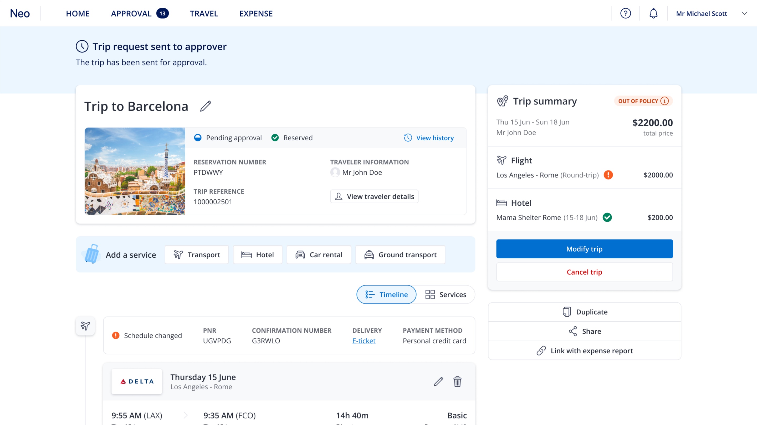
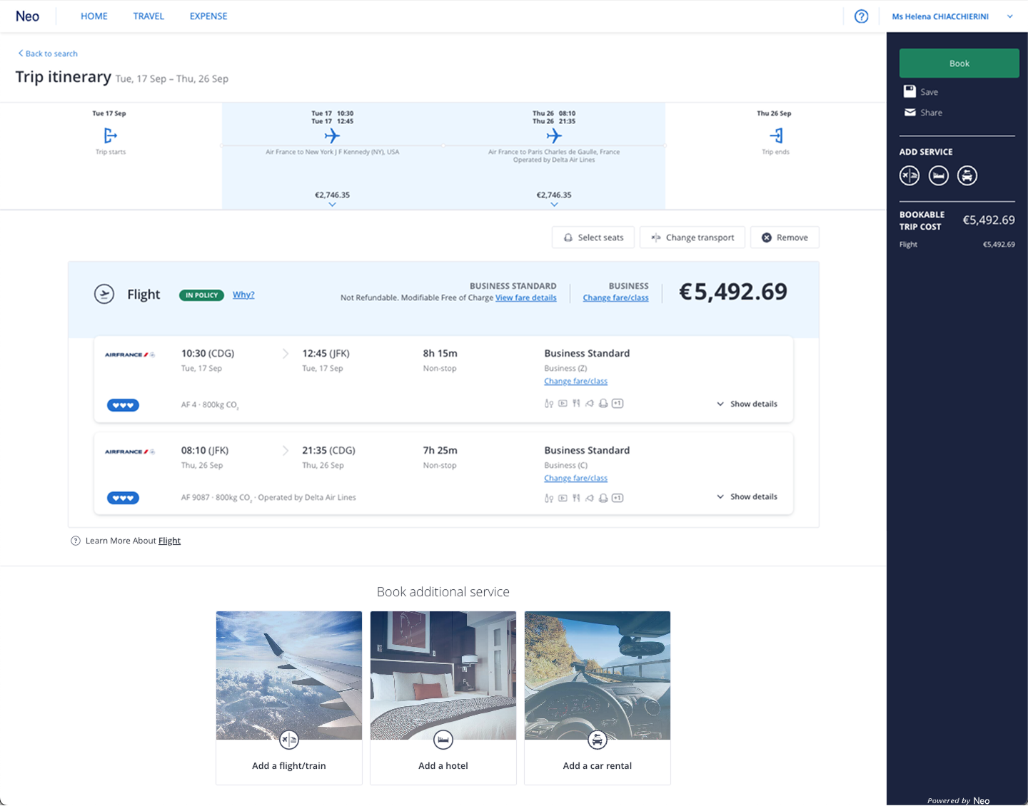
The existing Trip Overview page was built on outdated technology and faced several usability challenges: an unappealing interface, poor accessibility, and a lack of clear information hierarchy.
We used its technical migration as an opportunity to redesign the experience from the ground up, creating a more intuitive and visually consistent page.
This project involved user research, multiple design iterations, and close collaboration with Product Managers, Tech Leads, and client-facing teams to ensure both business goals and traveler needs were met.
Problem Statement
This project presented several challenges.
The first challenge was the diversity of personas using the "Trip overview" page. Currently, this page is accessed by multiple user types: the traveler, the travel arranger, and the trip approver. Understanding the specific needs of each persona was crucial to ensuring the platform effectively met their needs.
The second challenge was managing the large amount of information on the page and its varying levels of importance. A key focus was on establishing a clear information hierarchy. The trip verification stage is critical, as users need to feel confident about details such as dates, prices, and schedules without being overwhelmed by too much information.
The final challenge was designing a layout that would work seamlessly, regardless of the number of services included in the trip. Given Neo’s ability to book complex trips with multiple items (flights, hotels, car rentals, etc.) across different dates, it was essential to create a flexible layout that could accommodate all possible configurations without compromising clarity or usability.
How might we modernize a strategic page in the booking process, enhancing its accessibility while considering technical constraints?
Goals & Objectives
Understand user behaviors and pain points across all personas interacting with the Trip Overview page
Redesign the UI to fully comply with accessibility standards and deliver an inclusive experience
Leverage our design system, Glide, to ensure visual consistency, scalability, and easier long-term maintenance
Create a flexible layout capable of adapting seamlessly to any type or quantity of trip content
Monitor future usage by implementing analytics trackers and in-app feedback mechanisms to understand real usage and collect insights
Design Process
Research & Discovery
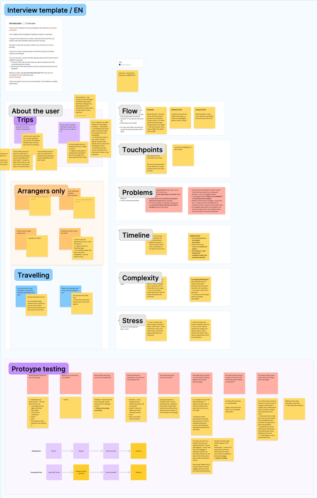
To better understand how the Trip Overview page was used and perceived, I conducted interviews with a diverse range of Neo users, including travelers, travel arrangers, and travel managers.
I also ran usability tests on the existing interface to observe real behaviors and identify key friction points in the booking flow.
Finally, a competitor analysis helped me benchmark best practices in the market and uncover opportunities to modernize our experience while staying aligned with user expectations.
Main user pain points:
Visual overload and readability issues: the page contained too much information, with small text and limited visual hierarchy, making it difficult to scan.
Limited visibility of trip details: the horizontal timeline did not display all trip items consistently across different screen resolutions.
Unclear interactivity: users did not understand how to interact with the timeline or what actions it enabled.
Missing key information: users were unable to locate the cancellation policy for their items, even though 100% of them stated it was the most important information to access.
Collaboration friction: travel arrangers struggled to find how to share the trip with travelers for booking validation, leading to confusion and extra steps.
If I want to modify my selection, I am lost, I don’t know that I can click on the [timeline] tiles and see the actions
Design
First iteration
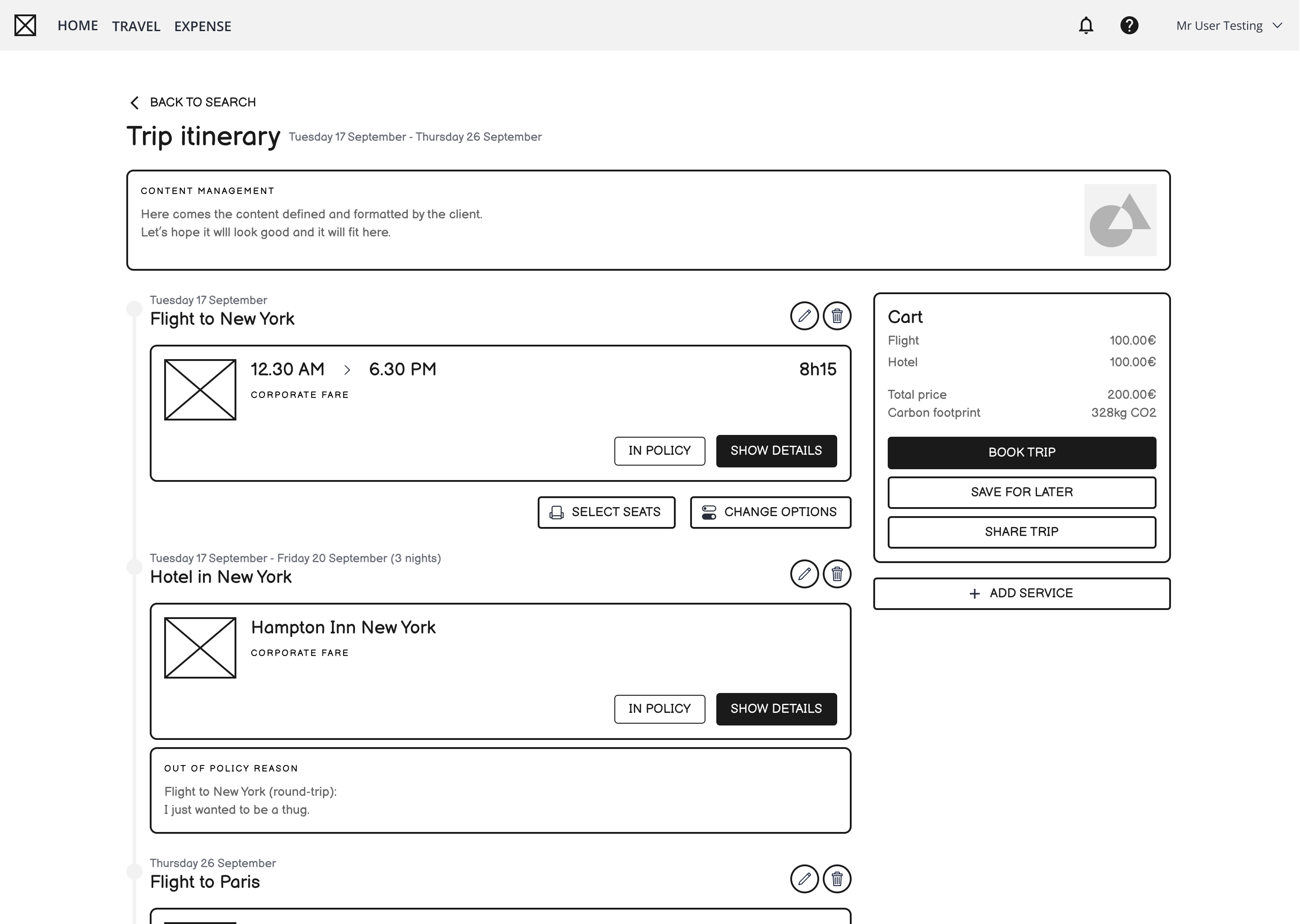
For the first iteration, I focused on addressing the main pain points identified during research by creating low-fidelity wireframes. I presented it to client-facing teams and tech leads to collect feedback, validate technical feasibility, and ensure alignment with user and business needs. Throughout this phase, I worked closely with the Product Manager and Tech Lead, iterating quickly based on their input to refine the proposed direction before moving into detailed design.
High-fidelity prototypes
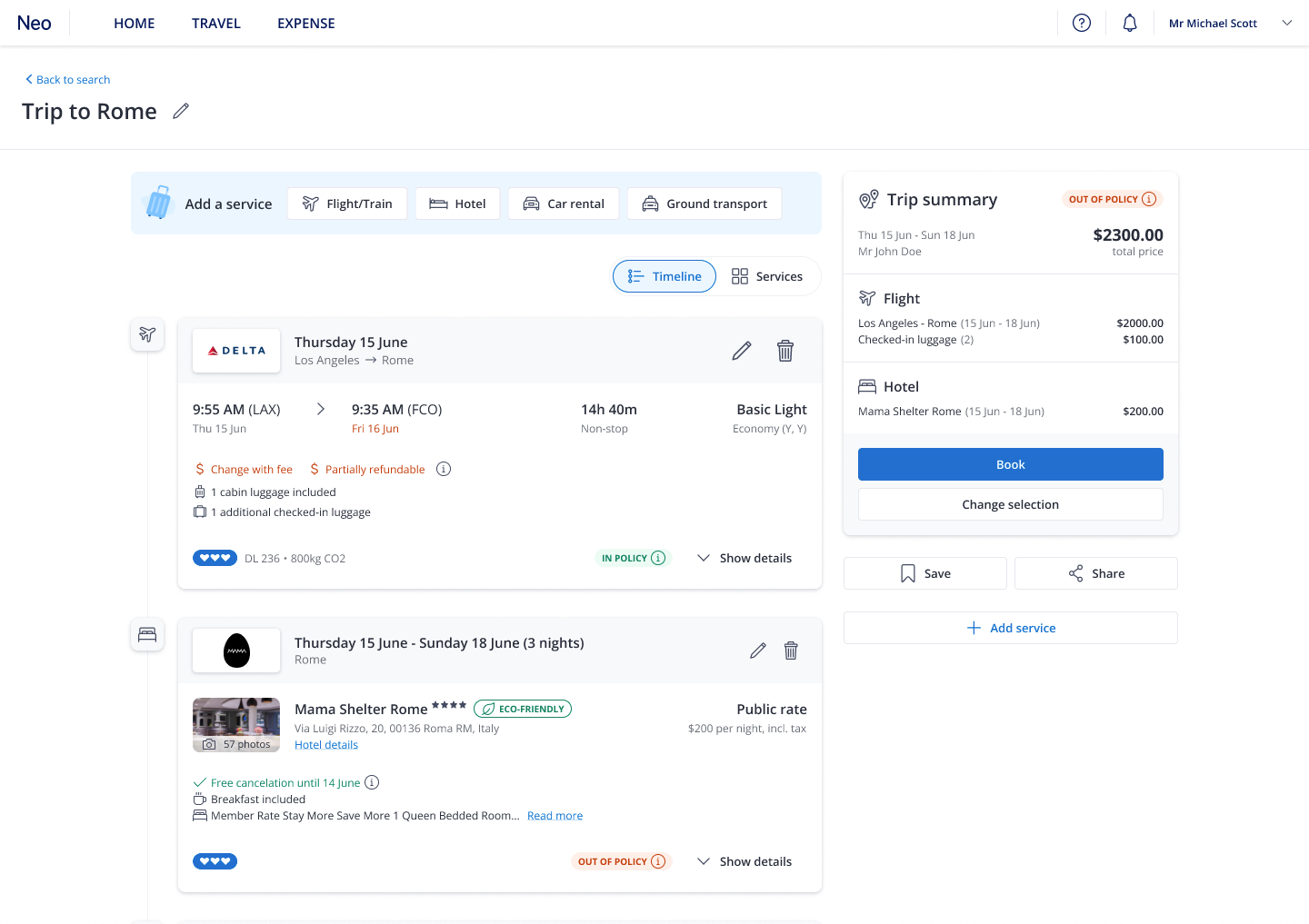
Once the direction was validated, I proceeded to build the high-fidelity prototypes. I applied components from our design system, Glide, to ensure visual consistency and alignment with our accessibility standards. Together with the Product Manager, I listed all potential use cases and contexts to make sure the layout could adapt to various trip configurations. We also explored edge cases, such as long itineraries or missing data, to challenge the flexibility and scalability of the design. This step allowed us to validate both the visual integrity and functional robustness of the new interface before testing.
Main pain points solved with the new layout
Introduced a vertical timeline to simplify the chronological reading of the trip and allow the display of an unlimited number of items without hiding any information
Implemented a content switcher component, allowing users to easily toggle between a timeline view and a services/items view
Redesigned the trip summary panel to centralize all pricing details, making it easier for travel arrangers and approvers to review trip information at a glance
User testing
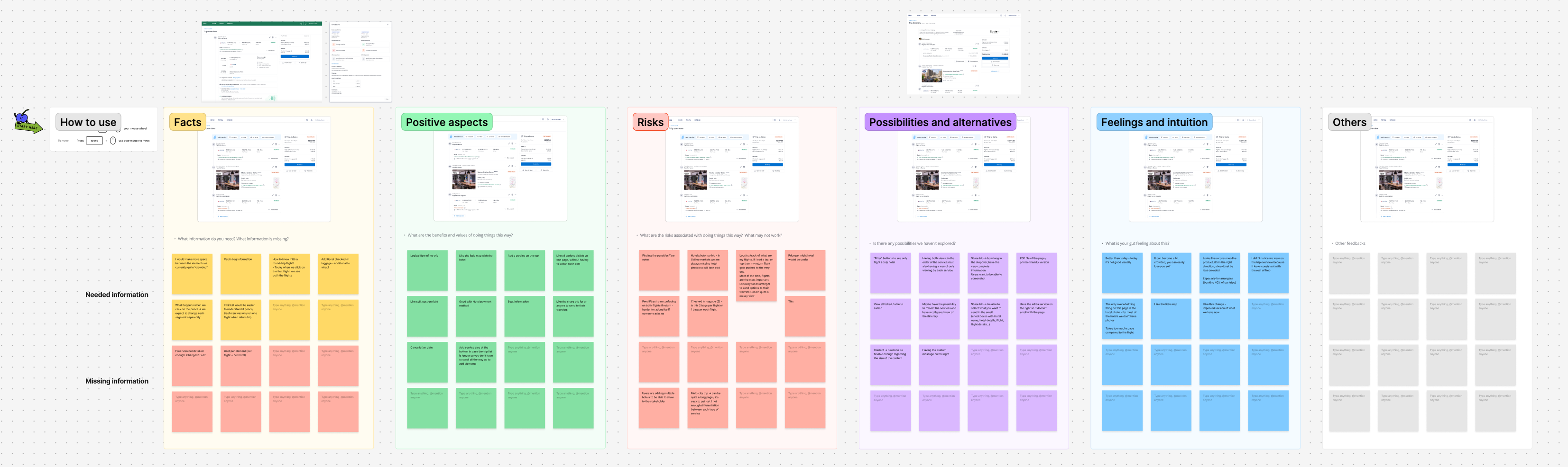
To validate this new vision, I organized focus group sessions with Amex GBT’s five largest clients, bringing together a diverse mix of travelers, arrangers, and travel managers. I personally led these sessions to gather qualitative feedback on the new layout, ensuring we addressed the needs of each persona. After each iteration, we refined the design based on user insights and clients' feedback. To complement these sessions, I conducted unmoderated user tests via usertesting.com, allowing us to quickly validate the latest version with a broader audience and confirm that our improvements truly enhanced clarity, accessibility, and usability.
Delivery
During the research phase, I held weekly meetings with the Product Manager and the Tech Lead to ensure alignment and technical feasibility. These sessions allowed us to share progress and ensure our proposals were technically sound.
The vision was defined collaboratively by our trio (Product Manager, Tech Lead, and me) and presented to the Scrum team responsible for the migration to align on a phased implementation strategy.
Once the PM wrote the user stories, I delivered detailed design specifications to the development team to support a smooth and accurate implementation.
After each development iteration, I am assigned a task within the story to review the implemented design and ensure it meets the required standards.
Outcome & Impact
90% of the new page was successfully migrated and delivered to production
Newly implemented trackers now allow us to monitor the number of items added to trips and will help measure the business impact in the long term
Accessibility score increased from 48% to 97% following an audit of the new page conducted by Atalan (*32 WCAG criteria supported compared to 16 previously)
Average booking time reduced from 1m46 to 1m32 within two months on the travel flow