My Bike Claim - 44% Reduction in inbound queries
By Samuel Plumb
Turning a stressful, confusing claims journey into a clear, confidence-building experience.
Impact
44% fewer inbound calls in 12 weeks
MVP in 6 weeks → V1.2 in 12
Mobile-first, high-contrast design system, reusable for future tools
The Problem
Claimants (often stressed/injured) had no visibility of their bike’s location
Internal teams overwhelmed by repeat calls and scattered updates
Proclaim tool unfit for motorcycle claims
60% mobile-only users, many non-native English speakers
Discovery
Shadowed call centre + stakeholders
Mapped complex workflows
Interviewed claimants → three mindsets: Reassured, Impatient, Confused
Non-negotiables: real-time > email, mobile-first, plain English, clarity over detail
Strategy
Used Shape Up → ship clarity in 6 weeks
Guardrails: thumbs-first, Deliveroo-like familiarity, transparency > beauty
MVP (6 Weeks)
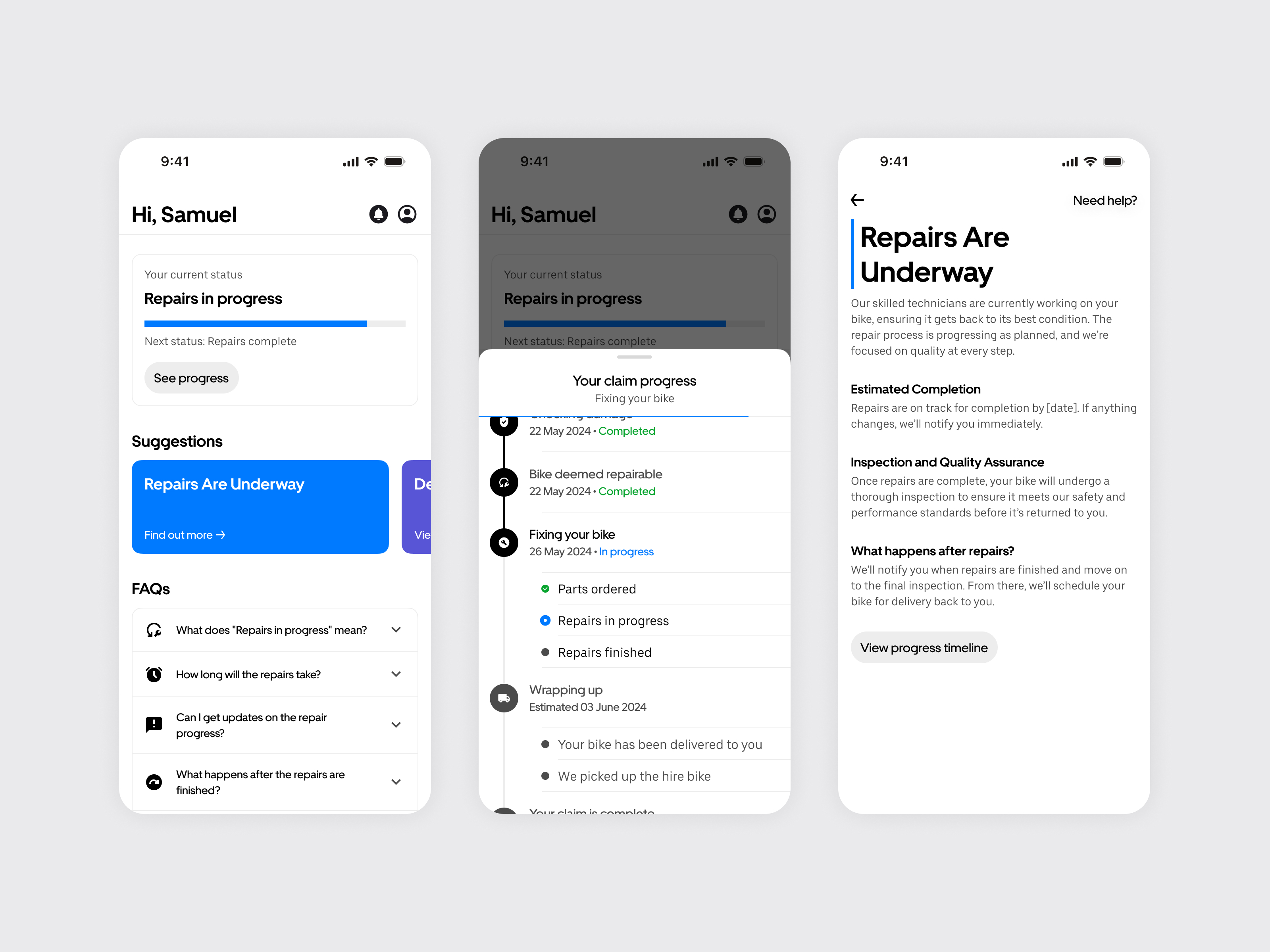
Linear progress bar with predictive dates
Updates feed for system + staff messages
Result: visibility improved, but regressions + clutter created confusion
Pivot (V1.2)
Timeline: whole journey (past, present, future)
Append-only micro-events → no regression panic
Clearer IA: headings + tappable cards → detail in modals
Separate inbox for staff/support vs. system events
Result
−44% inbound queries
Support staff saved hundreds of hours
Reusable, accessible design system created
Next
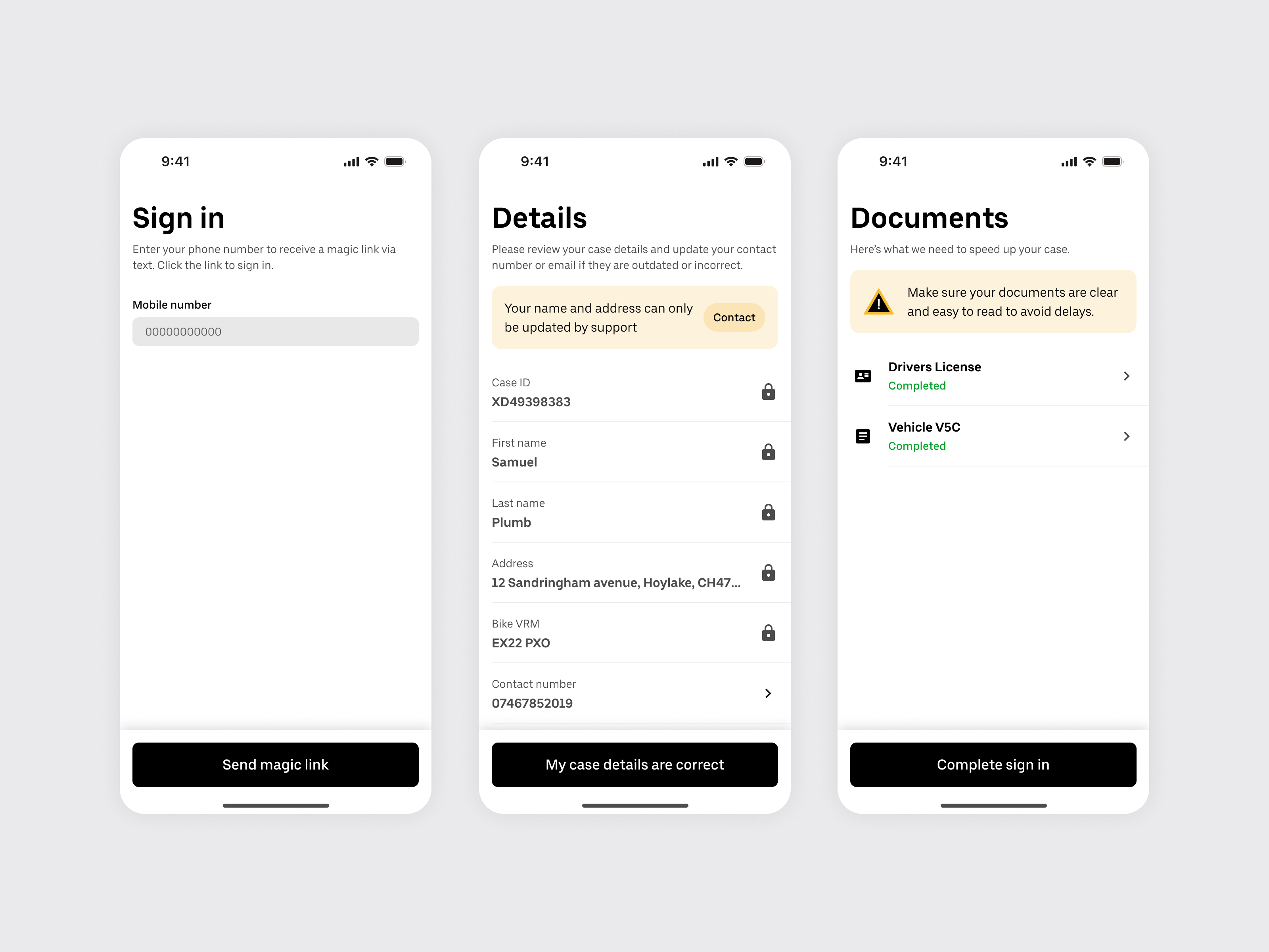
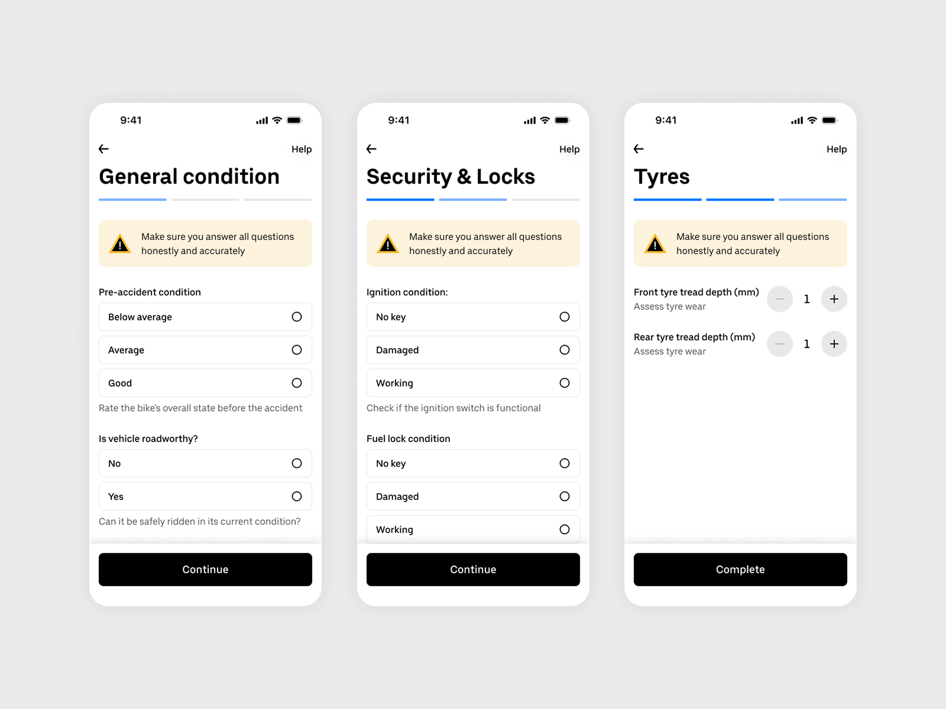
Automated onboarding via AI document verification → fewer staff tasks, faster claimant experience
Key Learning
In high-stress journeys, design isn’t about polish. It’s about clarity, confidence, and trust.